Branding / Web Design
Case Study
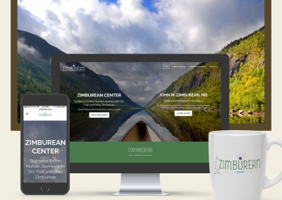
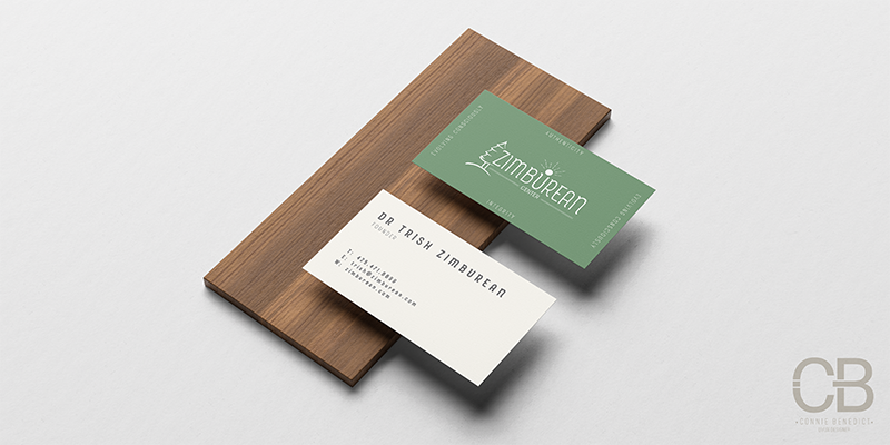
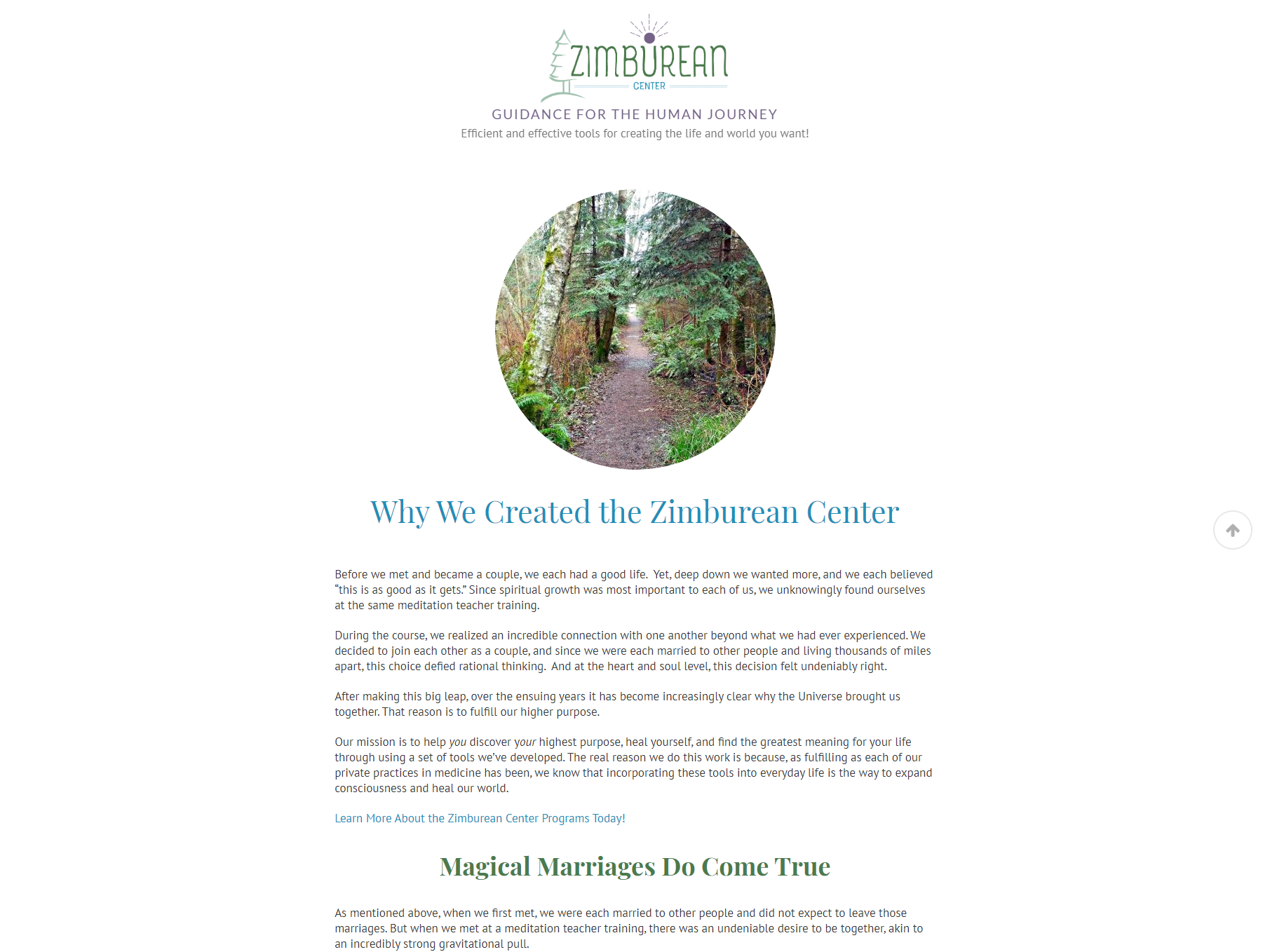
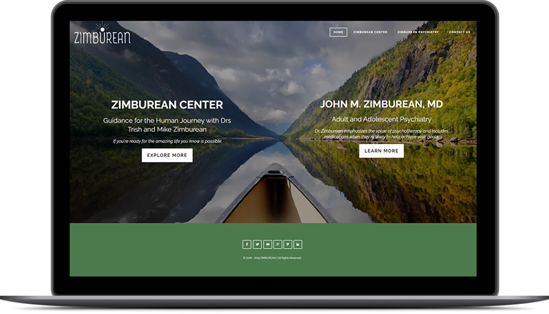
Zimburean Center
PROJECT
EXCITING NEW BRAND FOR A MINDFULLY NEW ENDEAVOR
Mike and Trish Zimburean envisioned a distinct look that included their mission and values as well as incorporating the landscape of their land. They wanted a new brand that captured the essence of their vision and to permeate the brand through both offline and online mediums.
CLIENT
Mike & Trish Zimburean
ROLES
Brand Identity
Web Design & Development

Creative Process
The Zimburean Center had a solid foundation for me to work with as I actualized their brand look. Trish and Mike knew what their new endeavor stood for, who they uniquely helped, and how they created transformation with their clientele. The brand process began with these established truths.
The Beginning
As with all branding projects, I begin with a deep dive into the mission, purpose, and values of the company. I seek to discern the why of the Zimburean Center, what challenge(s) the center solves, and why the services are unique in the industry to solving those unique challenges.
These fundamental questions, as well as others, shape the initiation into the design process.
Typography
When looking for the logo typography, I wanted it to feel flowing and smooth; create an atmosphere of easy access and warmth. I was seeking a look where the inner child within us all would want to come out and play. The Zimburean Center’s mission is to “help people open to who they really are, discover their highest purpose, heal themselves, and find the greatest meaning for their lives.”
While this work is deep and profound, it needs an access point that is inviting and warm. Though the logo uses cool colors, the shape can create that access point.
The Rainer font provided that entry point of warmth, relaxation, and comfort. It isn’t traditional. It is inviting child-like wonder and curiosity with a hint of nostalgia.
Color Palette
Zimburean center is about bringing people together, alignment, healing, growth, and expanding consciousness.
They help people find inner peace (green), self-love (pink), and compassion (light blue). They value the reconnection to the True Self (purple).
It is with these values in mind that the color palette was born.
Elements
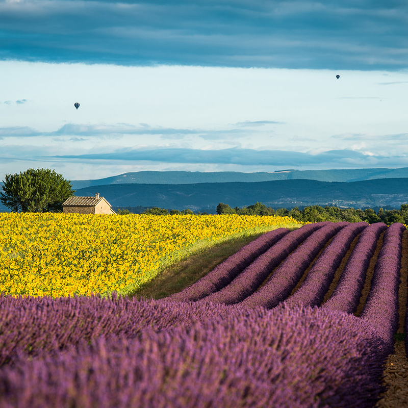
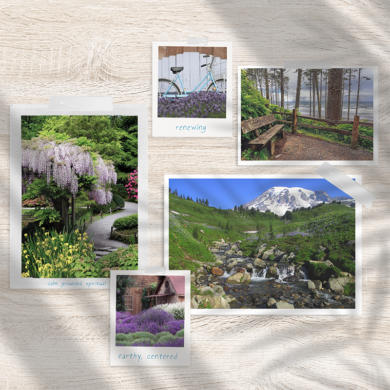
The Zimburean’s purchased land in Washington and desired that the brand focus on the landscape of the Zimburean Center.
- The pine tree was central to the value of being rooted in your True Self.
- Water represents the evolving consciousness.
- The radiating sun symbolizes spirit, energy, and the Great Work.
Each element carefully selected to represent the ideals of the Zimburean Center.


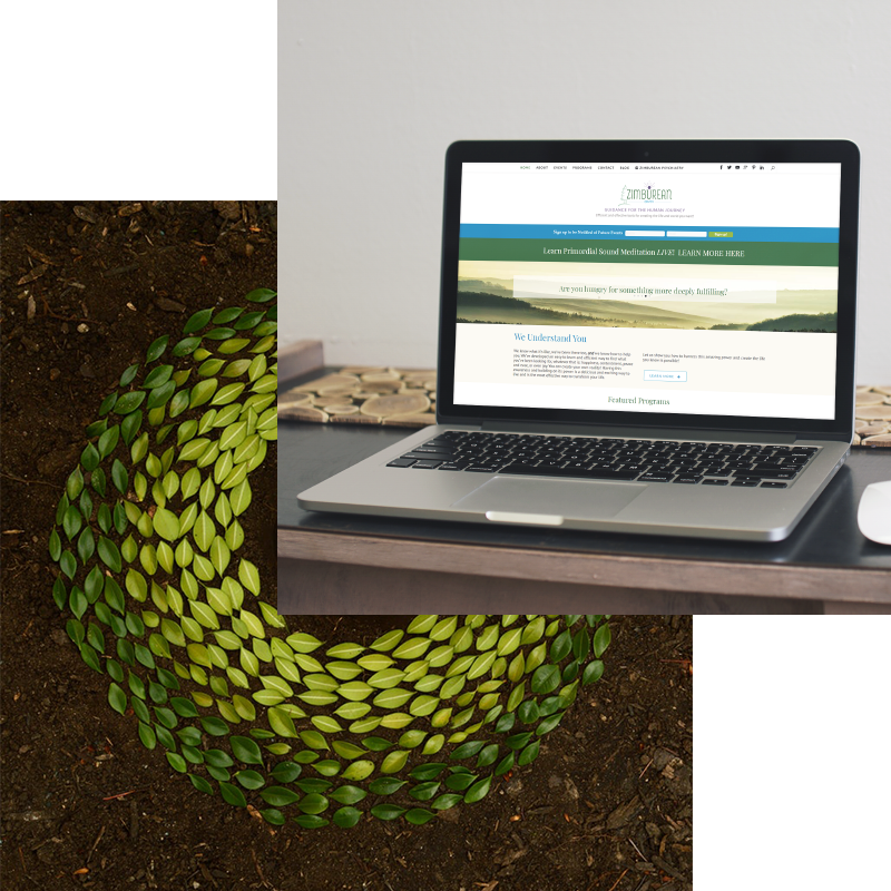
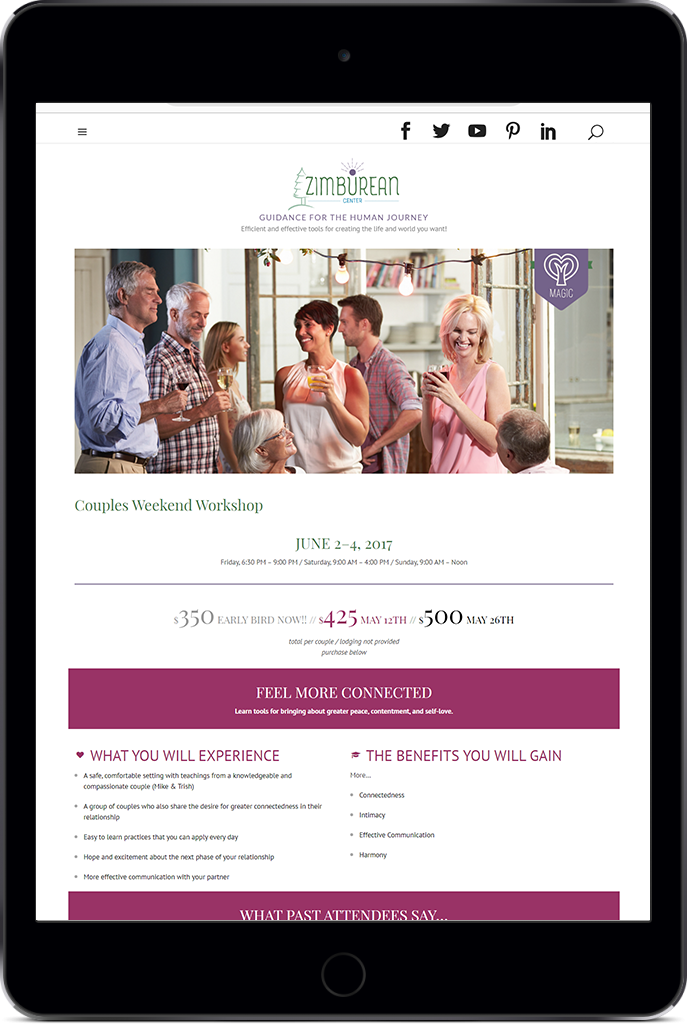
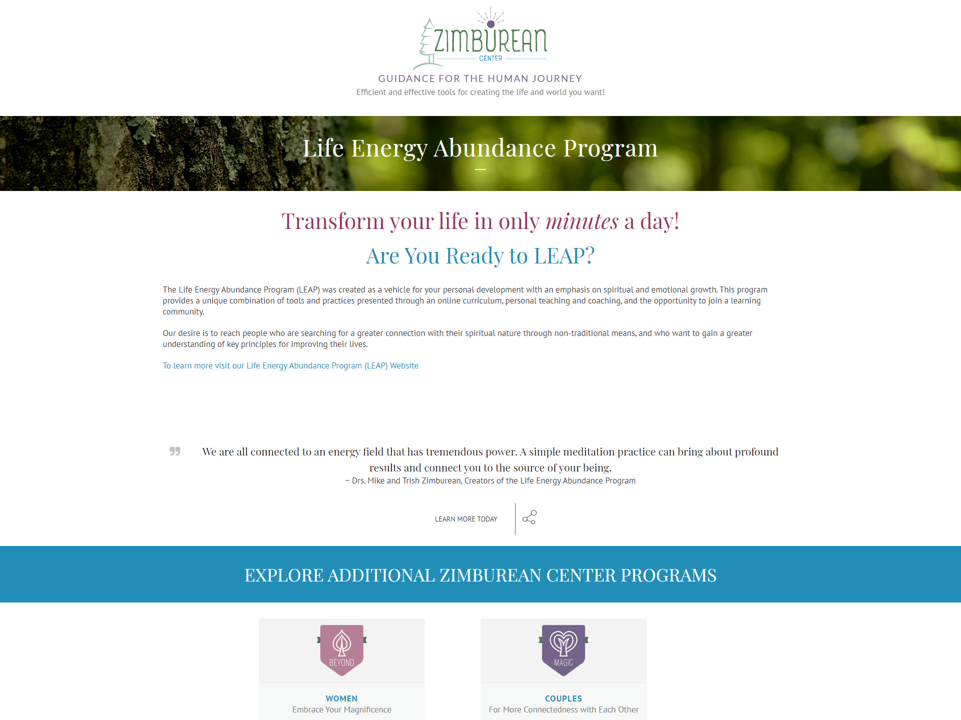
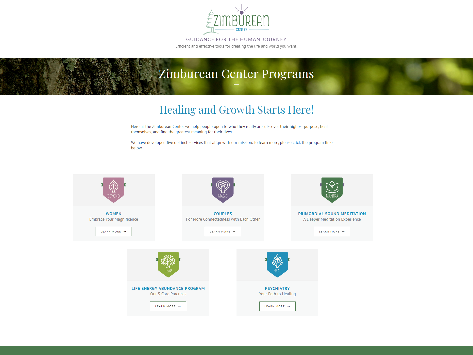
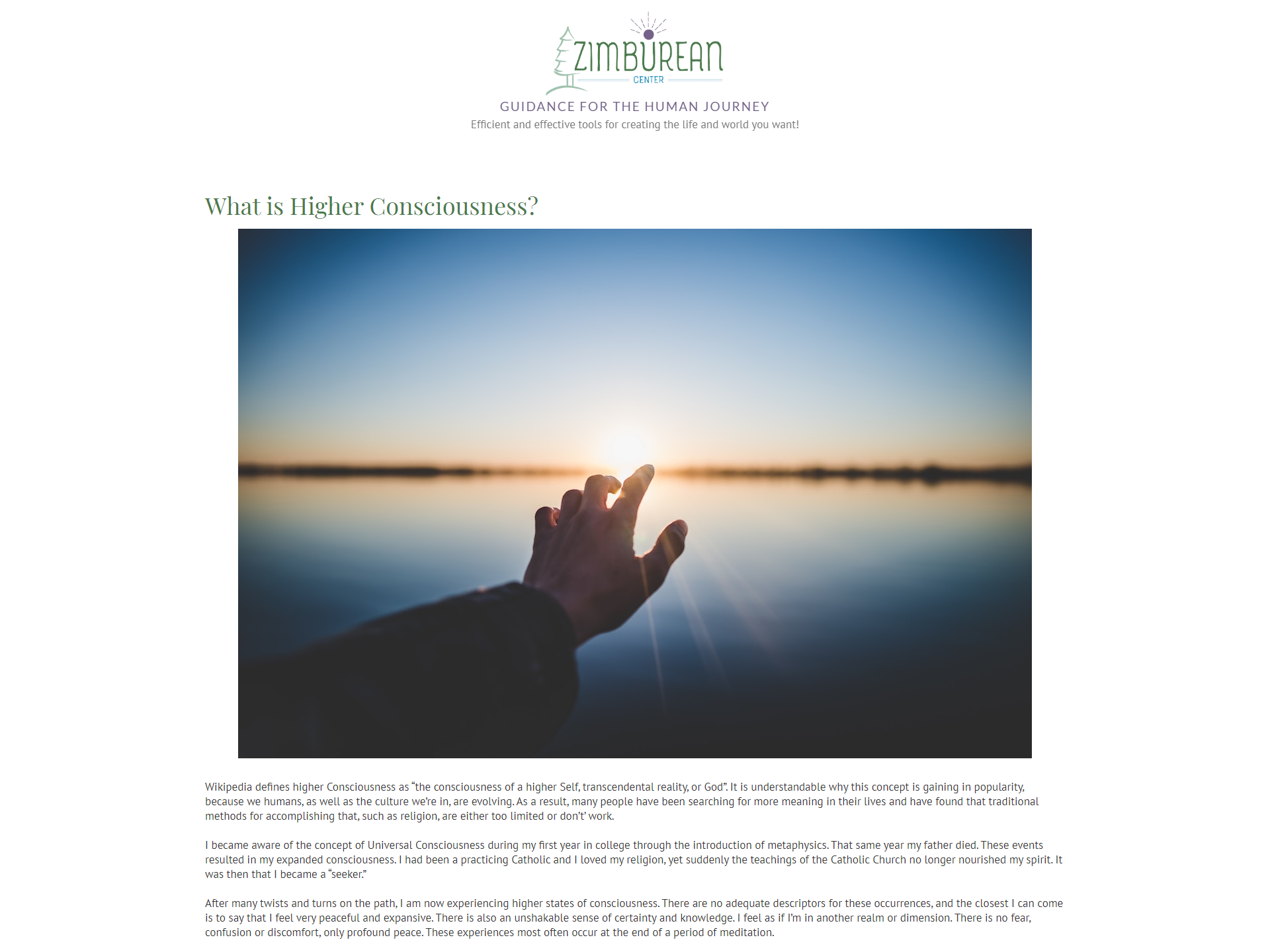
Website
Once the brand was established, the next phase was website design and development. Mike and Trish wanted the website to introduce potential clients to the Zimburean Center’s mission and purpose and inform them of upcoming events.
The central goals were to create an easy to access website with a minimum cognitive load that included the following:
Minimal Design
Responsive
Intuitive Navigation
Client Maintained
User Experience
Upon launch, the Zimburean’s enlisted others to view the new design and provide feedback. We were pleased with the evaluations we received as well as the overall feedback.
One item that was asked of us was to have an easy way to get on the emailing list. Due to this feedback, we decided to place an email signup on the top area of the homepage with a contrasting color that allowed it to be visible to new users.
The website was tested on several devices to ensure responsiveness. Again, some minor tweaks were made to accommodate the many devices on the market today.
This feedback was vital to a successful launch.

Client Testimonial
Connie,
We are very grateful and impressed with the amount of time, energy, and effort you have put into the Zimburean Center! We really like what you’ve created! Your strong intention to represent us authentically and well, is obvious.
You did a fantastic job and we have received a lot of positive feedback. Thank you so much for all the time, effort, and expertise you brought to this successful project! Per Chris at our last coaching session, “you guys did double the work in half the time” (it typically takes for a project of that magnitude).
Thank you for everything.
Many blessings,
Trish and Mike Zimburean