Design Sprint / UX UI Mobile Product Design
DESIGN SPRINT
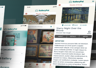
GalleryPal

PROJECT
GALLERYPAL DESIGN SPRINT
Using a modified GV design sprint, I sketched, designed, and validated a product concept that would improve the museum experience for users who are casual museum-goers who want quick access to information about the art they are viewing.
Roles
UI/UX Designer
UX Researcher
Brand Designer
DESIGN SPRINT PROCESS

User Research & Persona
Problem Statement
Design Objectives
User Flow Chart
DAY 2
Competitive Research
Crazy 8 Excercise
Three-Panel Solution
DAY 3
User Flow
Menu Hierarchy
Research
DAY 4
UI Components
Color Palette
Image Sourcing
Prototype
DAY 5
Usability Plan
Usability Results / Iterative Design
Minimal Viable Product (1st edition)
Reflections & Learnings
Post MVP considerations
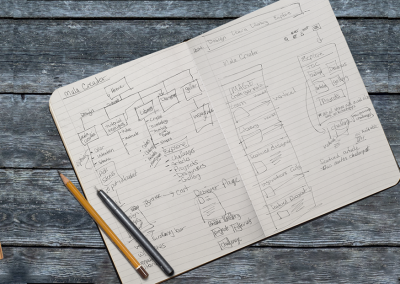
DAY 1: Understand & Map
USER RESEARCH & PERSONA
On Day 1, I was given research highlights that contained pivotal quotes from user interviews/surveys, a 17-minute video interviewing a museum tour guide, and a refined persona that included behavior, frustrations, and goals.
From this data, I was able to extract the key features for a minimal viable product (MVP). I formed a viable problem statement and mapped out a quick solution.
PROBLEM STATEMENT
Users who visit art museums feel that they would enjoy the experience more if they had access to key facts about the artist or the painting they are viewing without taking a tour. They are independent art viewers and want to experience the art on their schedule.
Researching the art beforehand feels overwhelming and time-consuming. They want the full experience of viewing the art, without all the time needed to research a particular piece of art, before or after visiting the museum.
Some users would like to quickly access a few key facts about one art piece and have a choice about which art they want to study more. They don’t necessarily want to be told how to feel but would love to learn what the artist’s intention might have been.
Also, different art viewers might be more interested in technique rather than intention or vise versa. Other art viewers want to hear from the artist themselves. What would the artist say about the art they created?
DESIGN OBJECTIVES
- Focus on improving the in-person viewing experience
- Design via mobile technology
USER FLOW CHART
OBJECTIVE
Organize my thoughts

DAY 2: Sketches
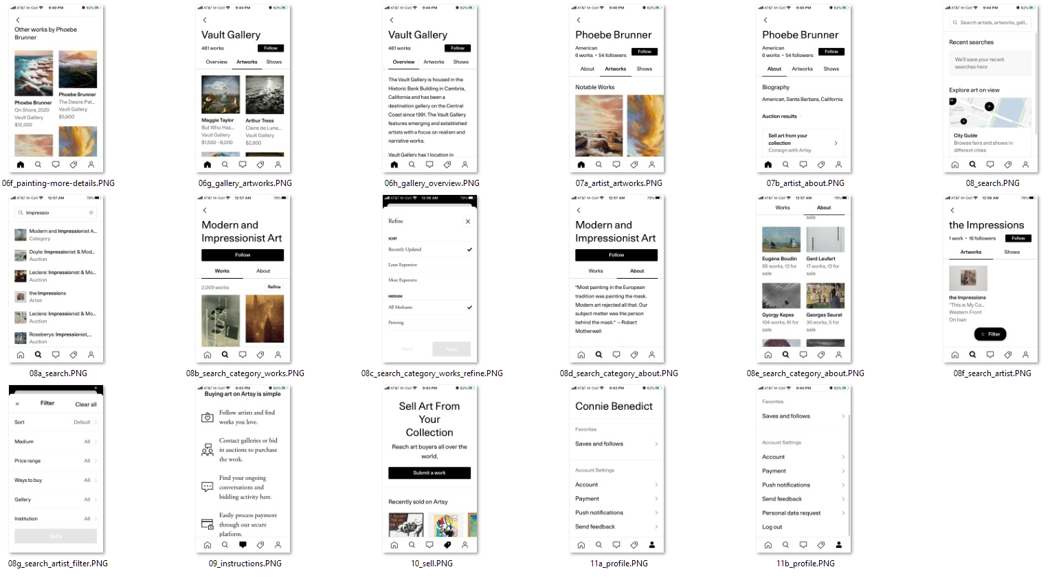
COMPETITIVE RESEARCH
Day 2 started by reviewing art mobile products. “Art gallery mobile apps” was typed in Google to locate 3 products.
- WikiArt
- Musée du Louvre
- Artsy
For each product, I gave myself 10 minutes to review, take screenshots, and record first impressions. This is called a lightning demo exercise. The goal is to look at solutions competitors have produced to solve a problem similar to the one I’m trying to solve.
WikiArt
LIKES
- Simple
- Easy to Navigate
- Order a Print
DISLIKES
- No Category Quick Search
- Long URLs in Descriptions

Musée du Louvre
LIKES
- Detailed Descriptions
- Painting Location
- Hi-Res Art Images
- Artist Information
- Audio Tour guide
DISLIKES
- No Welcome Page
- Cost to Play Audio Guide
- Cost to Read Extended Description
- Map Design; Flat & Unhelpful

Artsy
LIKES
- Welcome Screen for Context
- Viewing rooms
- Detailed Art & Artist Profile
- Well Laid Out
- Comprehensive User Profile
- Save Art to Favorites
- Save Artists
- Save Galleries
- Share Art in social media
- View Galleries & Exhibits
- Related art
DISLIKES
- Forced Sign in before Viewing
- Signup Process a Little Confusing
- Choose Category, Artist, & Budget immediately
- Onboarding Screens; felt pushy & nosy
- Icon Only Menu
- App Navigation – could go down a rabbit hole
CRAZY 8 EXERCISE
OBJECTIVE
Quickly Ideate 1 Critical Screen
Screen Chosen:
Art Description

THREE-PANEL SOLUTION
OBJECTIVE
Visualize the flow to and from the critical screen

DAY 3: Decisions & Storyboard
Day 3, I spent time working out the flow of the product. Reviewing the User Persona there were three key phrases that stood out.
- “Doesn’t look for specific exhibitions or artists.”
- “Goes and browses whatever work is being showcased.”
- “Loses interest due to how long and in-depth {articles} are.” *referring to books and articles
With these phrases at the forefront of my mind, I charted a simple design that allows the user to access information quickly and with minimal reading.
USER FLOW
OBJECTIVE
Visually chart the user’s path to guide the storyboard process

MENU HIERARCHY
OBJECTIVE
Understand the priority of the main pages

RESEARCH
I also spent time reading how other museums were solving this problem. My research led me to QR codes as a feature. I did find conflicting data on QR Codes.
One article said they enhanced visitor experience.1 This article was published in 2015. Then in 2016, another article spoke of the ‘life and death’ of the QR code.2 This Cuseum article created hesitation in deciding if I wanted to add this feature.
With further research, I located another article published in 2019 on medium.com with strong stats on the use of QR codes.3 This article convinced me to add the QR Code option to allow the user quick access to art information inside the GalleryPal product.
1 https://scanova.io/blog/blog/2015/08/08/visitor-experience-museums-qr-codes/
2 https://cuseum.com/blog/life-death-of-qr-codes-in-museums
3 https://medium.com/whitney-digital/qr-codes-alive-and-well-47115abd234
DAY 4: Prototype
Day 4 was spent transferring my sketches into Figma. I gathered the UI components, settled on a color palette, sourced images, and focused on the following red routes:
- Selecting a Museum
- Locating an Art’s information with QR Code
- Locating an Art’s information through Search
- Finding the Art’s location in the Museum
- Saving Art & Retrieving Art
- Selecting another Museum (Exit Museum)
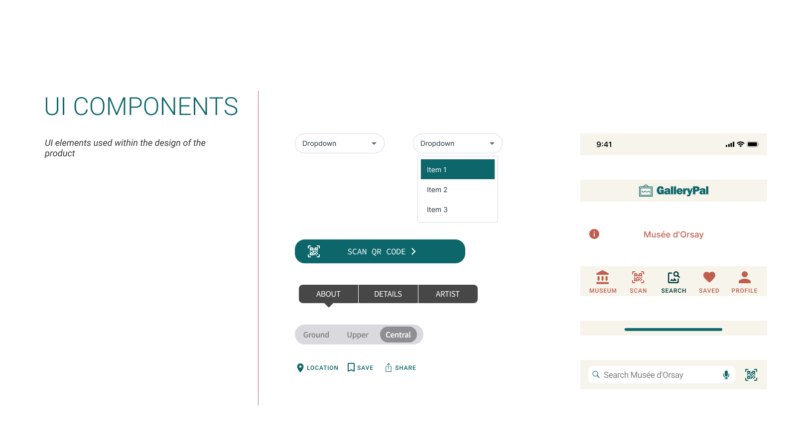
UI COMPONENTS
OBJECTIVE
Gather Standard Components to Build Prototype
COLOR PALETTE
OBJECTIVE
Create a standard visual look & feel for coherence

IMAGE SOURCING
PERMISSION
All but two images were sourced through my own personal collection. I visited the Musee d’Orsay in 2016.
The splash screen was from artist Alvan Nee (unsplash.com).
The museum selection image was sourced from the National Museum of Wildlife Art in Jackson Hole, Wyoming. It showcases artist Haley Badenhop.

PROTOTYPE
OBJECTIVE
Visually see how my sketches would function in an interactive prototype

DAY 5: Testing & Validation
USABILITY PLAN
In preparation for the usability sessions, I developed a test script and performed a trial run, ensuring the inclusion of items to be validated.
On Day 1 of the Design Sprint, I posted to social media recruiting friends to test the product on Day 5. I was able to schedule 4 usability tests performed over two days. Two of the users were experienced museum personnel with art history degrees.
USABILITY RESULTS & ITERATIVE DESIGN
During testing, two patterns became evident. The first pattern was the request for an audio option. After the third usability test and before the fourth, I iterated the design to include audio to test that iteration in the last session.
The second pattern was the logout icon. Though the icon is a standardized iPhone logout icon, all users were slightly confused by the image.
Overall, no participant struggled with the product. The most common feedback during testing spoke to the user-friendliness of the product. Each user gave significant input on valuable information for both Pre-MVP iterations and Post-MVP considerations.
User Feedback:
- “LOVE THE QR feature!”
- “LOVE the additional works feature on the artist page.”
- “The visual on the Gallery homepage is really cool!”
- “It is laid out according to what I would have imagined.”
- “It’s very simple and to the point. It gives me everything I need and it does everything I want it to do. It tells me what I want to know. “
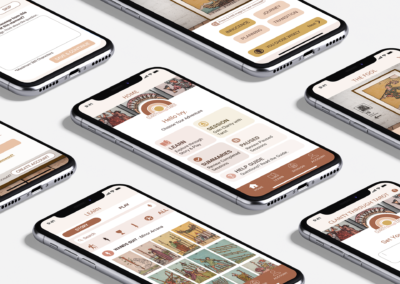
MINIMAL VIABLE PRODUCT (1st Edition)
The highest priority for the final prototype design was to tighten up the UI navigation. Below I walk you through the main features for the GalleryPal MVP (minimal viable product).
Choose a Museum
FEATURE
The home screen features a drop-down museum selection for the museum. In a live app, you could just type or voice the location.
Future Considerations:
Add a Find Museum from Current Location (map)
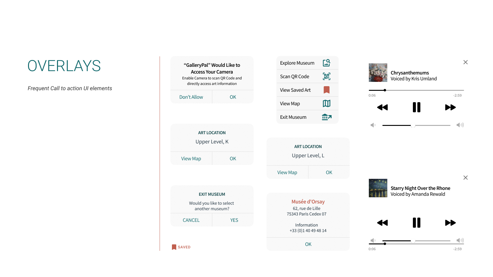
Scan QR Code
FEATURE
Allows quick access to Art Information
Art Information
FEATURE
Includes historical information about the painting, any fun facts, painting style, and technical details such as year, providence, and more. Plus it has an area to learn more about the artist and shows you additional paintings that are located in the museum from the same artist.
Future Considerations:
Add an art journal/experience feature to personalize the product per user
Listen to an Audio
FEATURE
An art expert in your pocket! Allows the user to listen to an expert talk about the art.
Search for an Art Piece
FEATURE
No QR Code? No Problem. The user can locate the art piece by typing in the artist or art name.
Art Location
FEATURE
Allows the user to locate a painting they are interested in.
Future Considerations:
Interactive Map
Save an Art Piece
FEATURE
Allows a user to save (bookmark) the art for later review
Exit Museum
FEATURE
Allows the user to exit the current museum, with the option to select another museum
CONCLUSION
Reflections & Learnings
The design sprint allowed me to be super focused on creating an MVP. The clearly defined persona helped narrow down the importance of certain features to help that user accomplish their immediate goal.
Post MVP Considerations
During usability tests, many great suggestions were given by the users. Here are a few that would be beneficial for later editions of the product:
- ADA Compliance
- Text Size Options
- Screen Reading
- Plan my Visit
- Curator’s Tour Guide, structured guide of ‘not-to-miss’ artwork
- Add a pre-screen asking the type of user (analytical or historical) and customize the art information page to ensure the most important features to that type of user are front & center
- Organize the Museum homepage based on art categorization
- Create Custom Tours based on art preferences