UX UI Design / Mobile App Design / Branding
Case Study
Clarity through Tarot
PROJECT
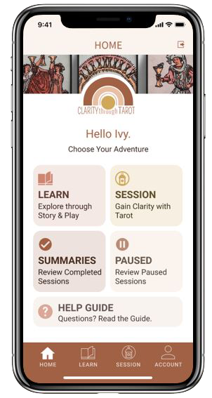
CLARITY THROUGH TAROTTM PRODUCT DESIGN
Clarity through TarotTM is a passion project. I was first introduced to the Tarot in a Jungian psychology class while studying the Hero’s Journey. I learned how the Tarot could be a tool for self-awareness and personal development. I was hooked.
Post class, I was quickly disappointed to learn that popular materials on the Tarot failed to satiate my growing affinity for interpreting the Tarot through archetypal stories.
I aspired to produce a product that felt accessible and provided profound, transcendent experiences through connection to the Tarot archetypes.
Below are the steps from ideation to sketches, wireframing to high-fidelity designs—the birth of this idea from conception to a digital prototype.
Roles
UI/UX Designer
UX Researcher
Brand Identity
Project Management
PRODUCT DESIGN PROCESS

The Hypothesis
Research Methods
Market Research
Competitive
Analysis
User Surveys
User Interviews
DEFINE
Problem Statement
Project Goals
Affinity Map
Empathy Map
Personas
How Might We…
PROTOTYPE
User Stories
Information Architecture
User Journey
User Flow
Concept Sketches / Interactive Prototype
Usability Testing
Wireframes
DESIGN
Brand Platform
Mood boards
Brand Identity
Style Guide
Design System
Accessibility Audit
High Fidelity Design
Interactive Prototype
TEST
Usability Plan
Usability Tests / Iterative Design
Minimal Viable Product (1st edition)
DISCOVER
THE HYPOTHESIS
First-time tarot learners can feel intimated and overwhelmed by all the information in today’s instructional marketplace to understand and apply the Tarot as a self-development tool. I want to explore methods that support users’ goals in learning the Tarot with ease and comprehension.
RESEARCH METHODS
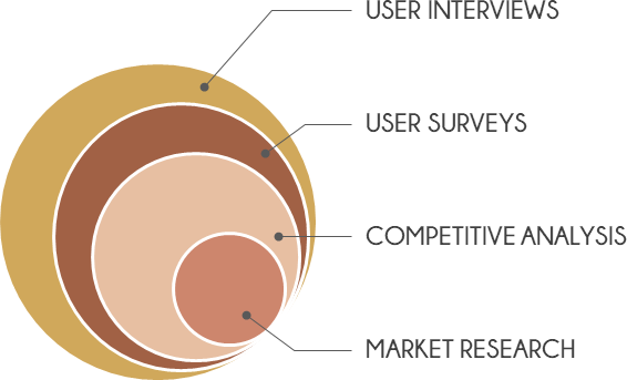
MARKET RESEARCH
Research Tarot Industry; Market Saturation; eLearning Statistics; Tarot Product Usage
COMPETITOR ANALYSIS
Design Implementation; Subject Focus
USER SURVEYS
Test Hypothesis; Identify Candidates for User Interviews
USER INTERVIEWS
MARKET RESEARCH
OBJECTIVE
Gather insights through industry research learning about delivery methods and market growth expectations
Market & Mobile Viability
Tarot Industry
Tarot is classified under the metaphysical services industry. That industry is estimated to be worth US$2.2 billion in 2018 with an expected growth of 1% a year for the next 5 years.
Internet Search
Researching ‘Tarot and Psychology’ in Google produces over 9 million results. These results would suggest that users are using the Tarot as a self-awareness tool.
New questions for analysis:
- How do people who seek self-actualization feel about a Tarot mobile product?
- Will they trust a mobile product to deliver clarity in their life?
eLearning
“According to the 2019 report from Shift Learning, “Mobile eLearners typically study for 40 minutes longer than students using a desktop or tablet.”
Source: https://elearningindustry.com/mobile-based-education-apps-transforming-industry
COMPETITIVE ANALYSIS
OBJECTIVE
Observe and evaluate the competitor landscape
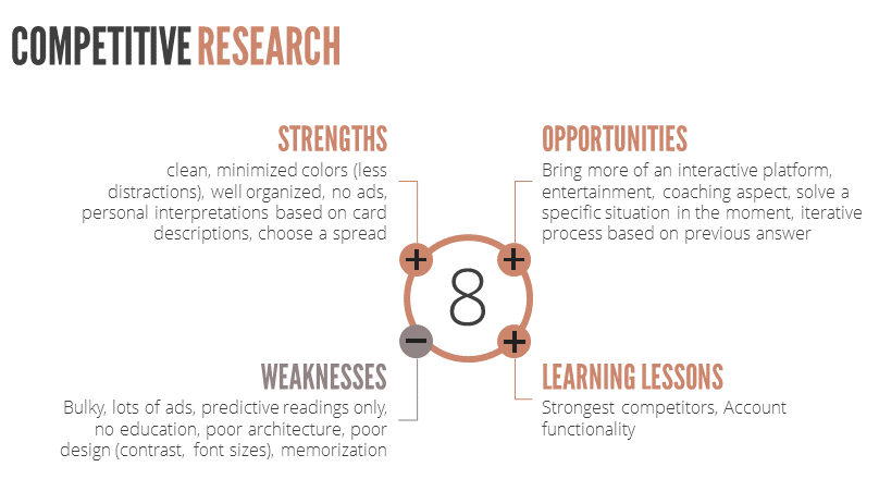
In my competitive analysis, I reviewed other Tarot mobile products as well as meditation and self-care mobile products. I evaluated app ratings, reading styles, learning methods, sign up processes, and overall usability. I also conducted heuristic evaluations on 3 mobile products and learned what works and what doesn’t from a user perspective.
Below are some of my findings:
USER SURVEY
OBJECTIVE
Gather data about potential users for product concept; identify ideal candidates for user interviews
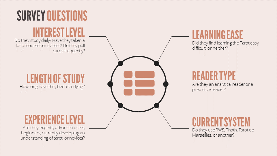
The User Survey focused on eight key areas:
Outcome
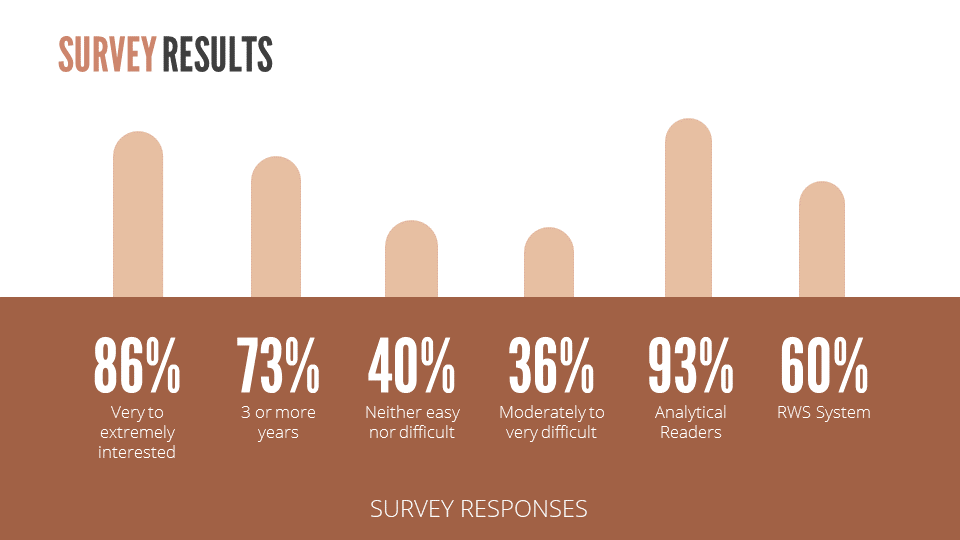
The majority of participants are highly interested in the Tarot (86% very to extremely interested), have been studying for 3-years or more (73% 3 or more years), and work with the Tarot for self-development and awareness (93% analytical readers). This indicates an ideal user segment for the proposed product concept. Advertising the release of the launched product where I posted the survey makes for a smart marketing strategy.
I expected to validate my hypothesis that the Tarot is challenging to learn and was surprised to discover that 40% find it neither hard nor easy. I explored the rationale for this result in the User Interviews.
Since this product focuses on the RWS system, learning that 40% of the survey respondents do not use the RWS system influenced the user interview candidate qualification process.
USER INTERVIEWS
OBJECTIVE
- Discern users goals for learning the Tarot
- Understand the barriers to learning the Tarot
- Gather study techniques / methods used to learn the Tarot
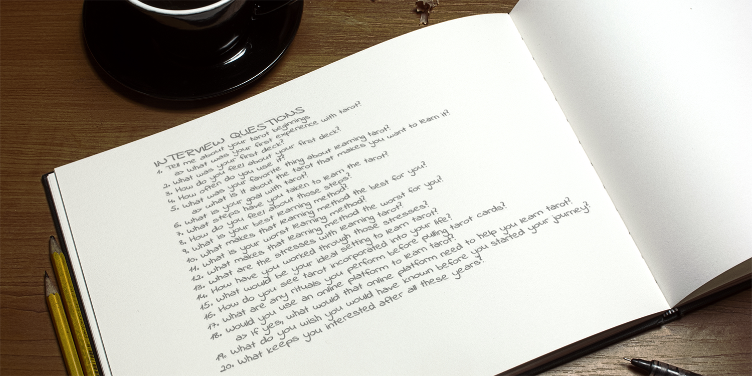
I conducted user interviews via Zoom with three groups. With the beginners (little to no experience) and intermediates (working with the Tarot for a few years), I sought to learn about what brings them to the Tarot and keeps them engaged in learning the Tarot. With the advanced (teachers of the Tarot), I explored the Tarot user experience from the teacher lens.
Findings from these three groups helped to drive the product features that will be explored in the Define stage.
DISCOVER SUMMARY
All of the aforementioned Discover data set me up to move successfully into the Define stage.
DEFINE
PROBLEM STATEMENT
The Tarot can be a highly effective personal transformation tool when explored through the lens of mythological story and Jungian archetypes. Two primary barriers to entry prevent seekers from using the Tarot for this purpose:
- The perception that the Tarot is complex, overwhelming, and confusing (as confirmed in User Interviews);
- Its association as a prediction tool or fortune-telling tool.
A product delivered through mobile technology would break down these barriers and allow seekers to experience the Tarot as a personal transformation tool.
PROJECT GOALS
INTRODUCE
Introduce a wider audience to the Rider-Waite-Smith (RWS) Tarot with a focus on Jungian archetypal images
FUN
Create an interactive, educational, enjoyable, accessible, and easy to learn system
INSIGHTS
Provide a format that supports users to reach clarity around an intention
TRANSFORM
Cultivate an opportunity for life-changing experiences that awaken users to a more satisfying life
AFFINITY MAP
OBJECTIVE
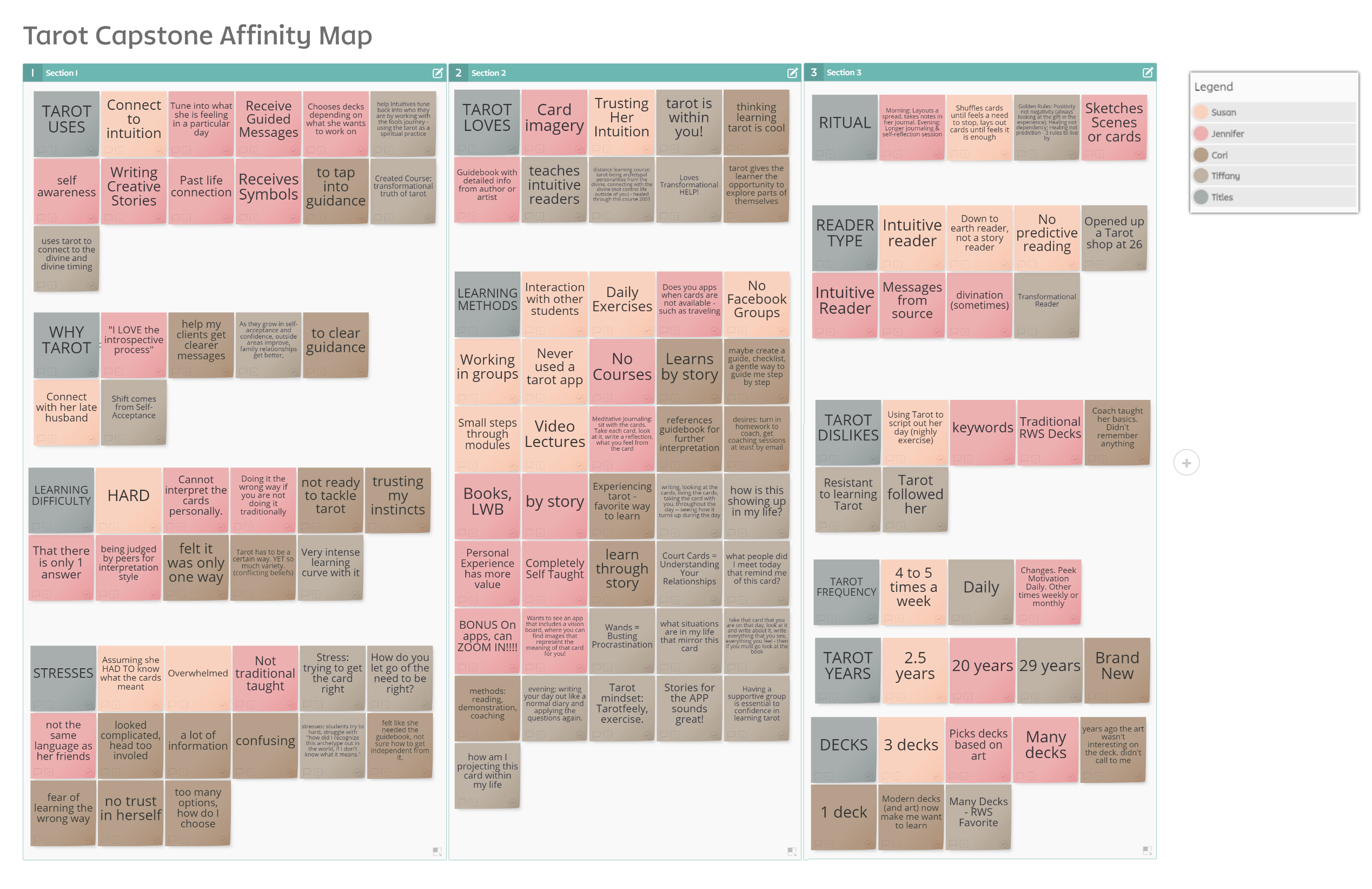
Sort through the user interviews, grouping common themes based on their natural relationships, for review and analysis
Outcome
Out of all the possible themes that emerged from this Affinity Map, I chose to focus on four that would have the greatest impact on the efficacy of this product, given the project’s goals:
- Learning Difficulty
- Stresses
- Learning Methods
- Tarot Uses
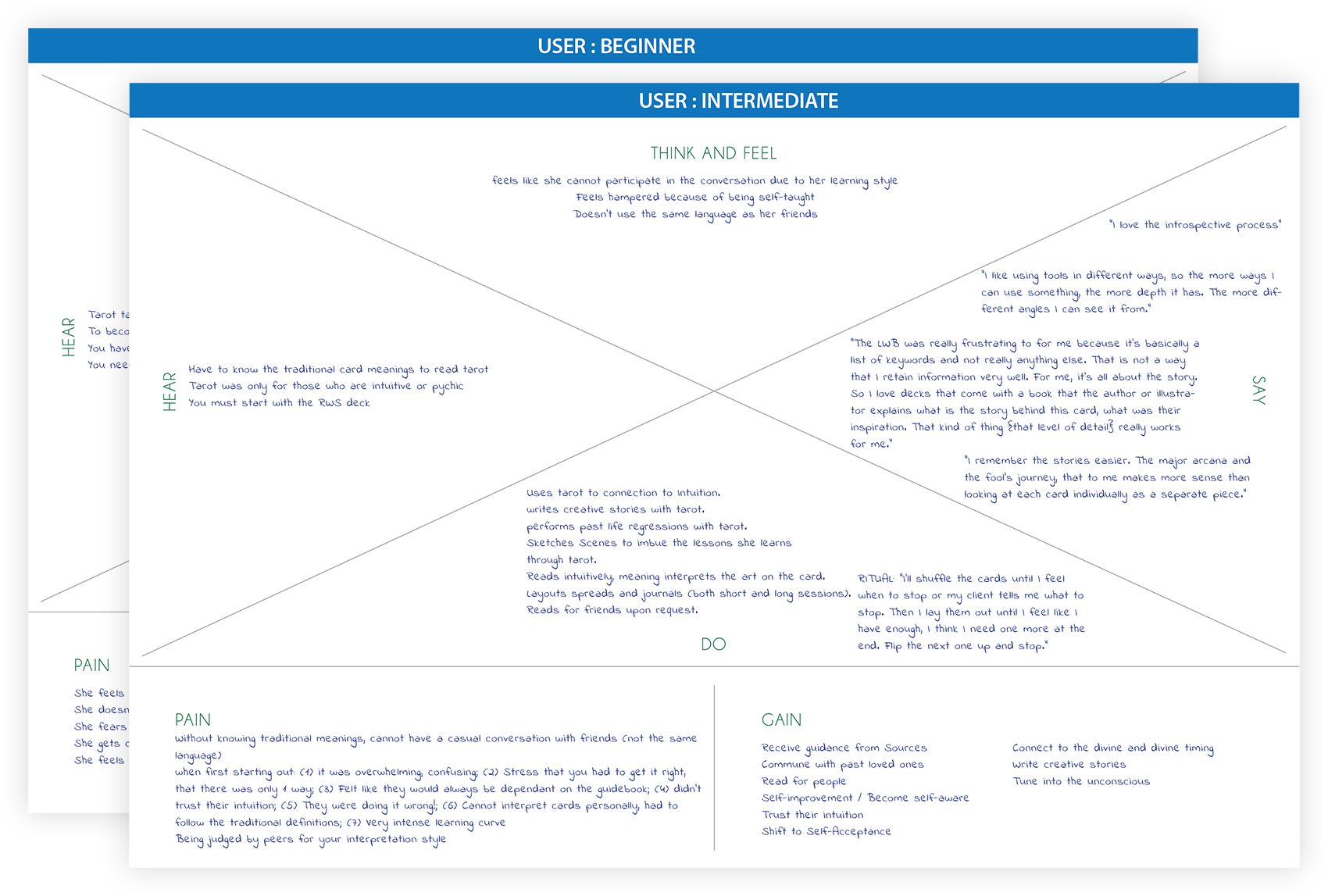
EMPTAHY MAP
OBJECTIVE
Sort through the user interviews, grouping how the user thinks and feels, and what the user does, says or hears from others about the Tarot
Outcome
The most surprising pain point from this Empathy Map was to learn that the intermediate users find the Tarot a lonely endeavor and yearn for a community that shares their viewpoints and common language around the Tarot.
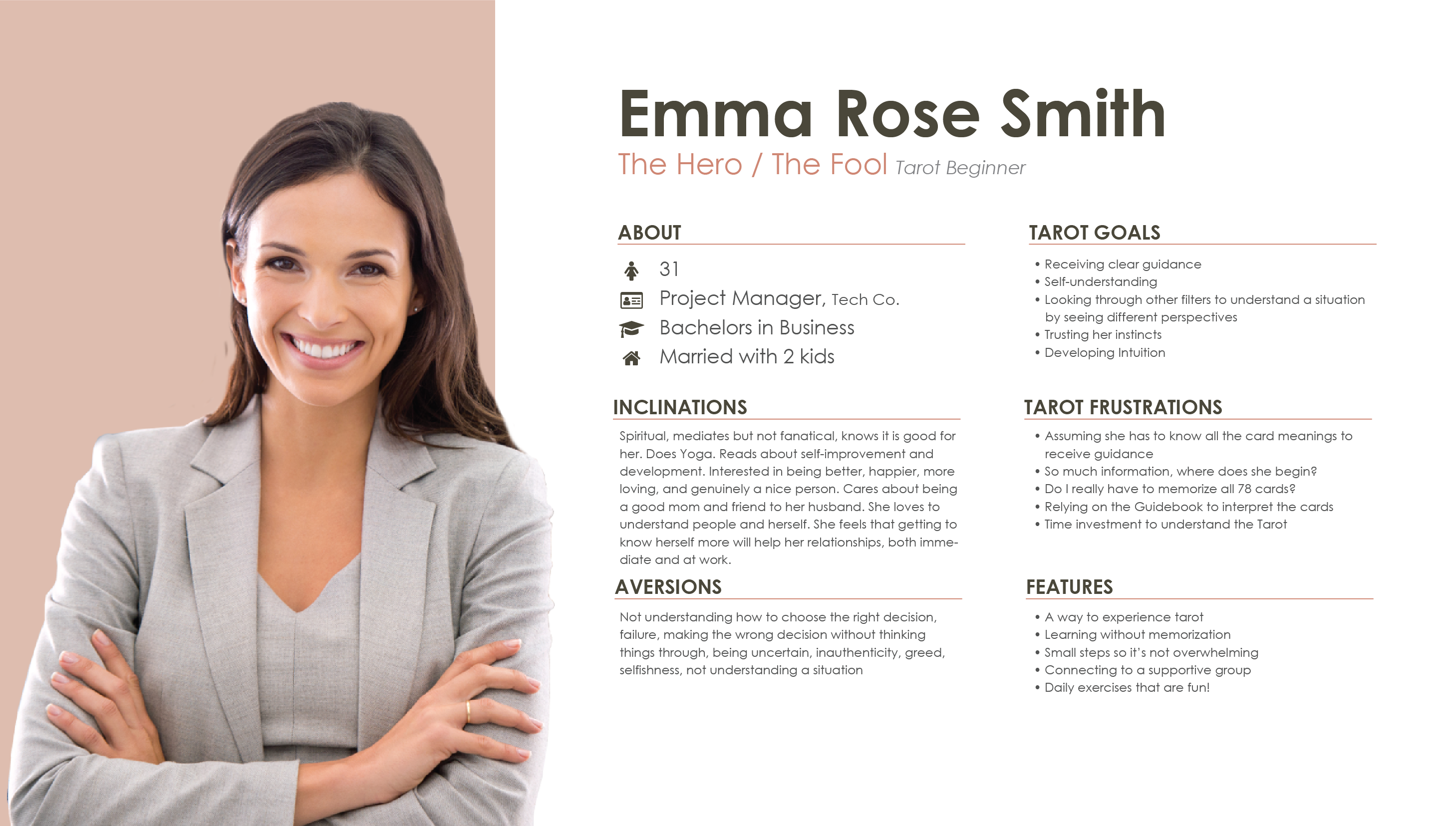
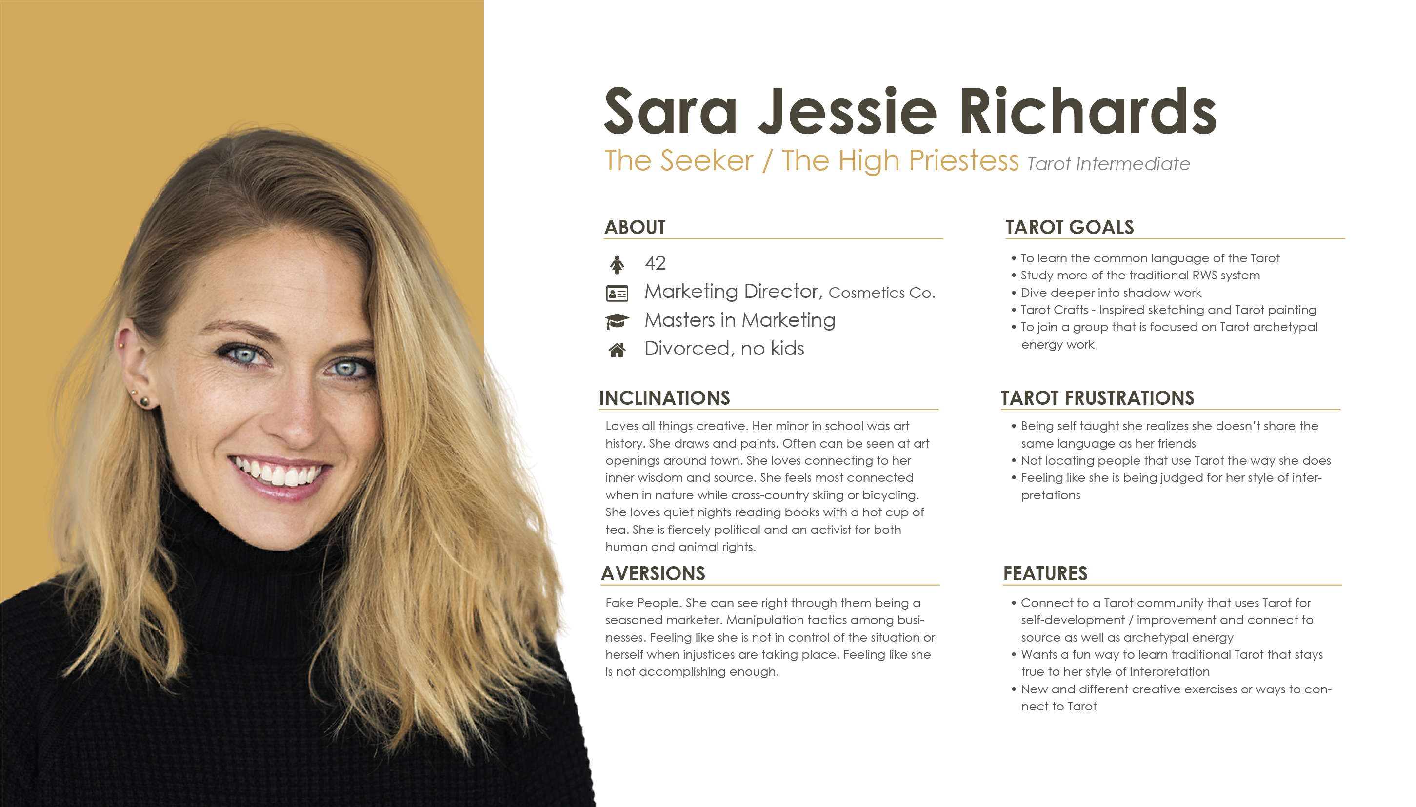
PERSONAS
OBJECTIVE
From the user interviews, define Personas that represent the principal user types that may use this product
The Hero / The Fool
“When I started on my spiritual path, I felt like I needed the guidebook because I didn’t rely on my intuition.”
The Hero, also known as The Fool in the Tarot, is passionate about personal empowerment. More than likely they have sought out other techniques for self-improvement and awareness. They have engaged very to little to no engagement with the Tarot for a few reasons: don’t know where to begin, time investment to understand the Tarot, and/or basic misconceptions about the Tarot (memorizing 78 cards, fortune-telling). Yet, there has also been a curiosity about the Tarot.
The Seeker / The High Priestess
“The book was really frustrating for me because the LWB (little white booklet) is basically a list of keywords and not really anything else. That is not the way that I retain information. For me, it’s all about the story.”
The Seeker has a thirst for wisdom and truth. They revel in connecting to their higher self, freeing themselves from outmoded beliefs and releasing negative thought patterns. They are intuitive thinkers and read often, hence why I also associate them with The High Priestess archetype. They seek to deepen their practice and delve further into the stories of the archetypes; their qualities, messages, light and shadow attributes, etc.
Outcome
Personifying users in this way, kept them top of mind and allowed me to ask them for guidance through an active imagination technique (Jungian psychology tool) when creating the product’s design and features.
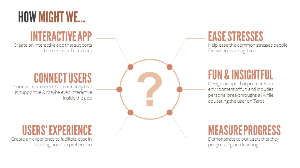
‘HOW MIGHT WE’ QUESTIONS
OBJECTIVE
Brainstorm solutions to solving users’ pain points
From understanding the users, I created the following ‘how might we’ questions as a way to seed ideation for the Prototype stage in the Product Design Process.
DEFINE SUMMARY
In the Define stage, I clarified who this product would be for, what their current pain points are, and why they would use this product to solve their current pain points. Next up is the Prototype stage that is the initial attempt to solve the users’ pain points.
PROTOTYPE
USER STORIES
OBJECTIVE
Understand the tasks a user wants to accomplish with the product
Outcome
This step was essential to organizing and prioritizing the features that would show up in the MVP (minimal viable product).
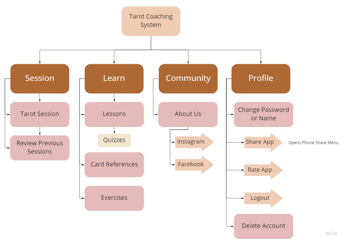
INFORMATION ARCHITECTURE
OBJECTIVE
Create a high-level sitemap based on the priorities in the User Stories
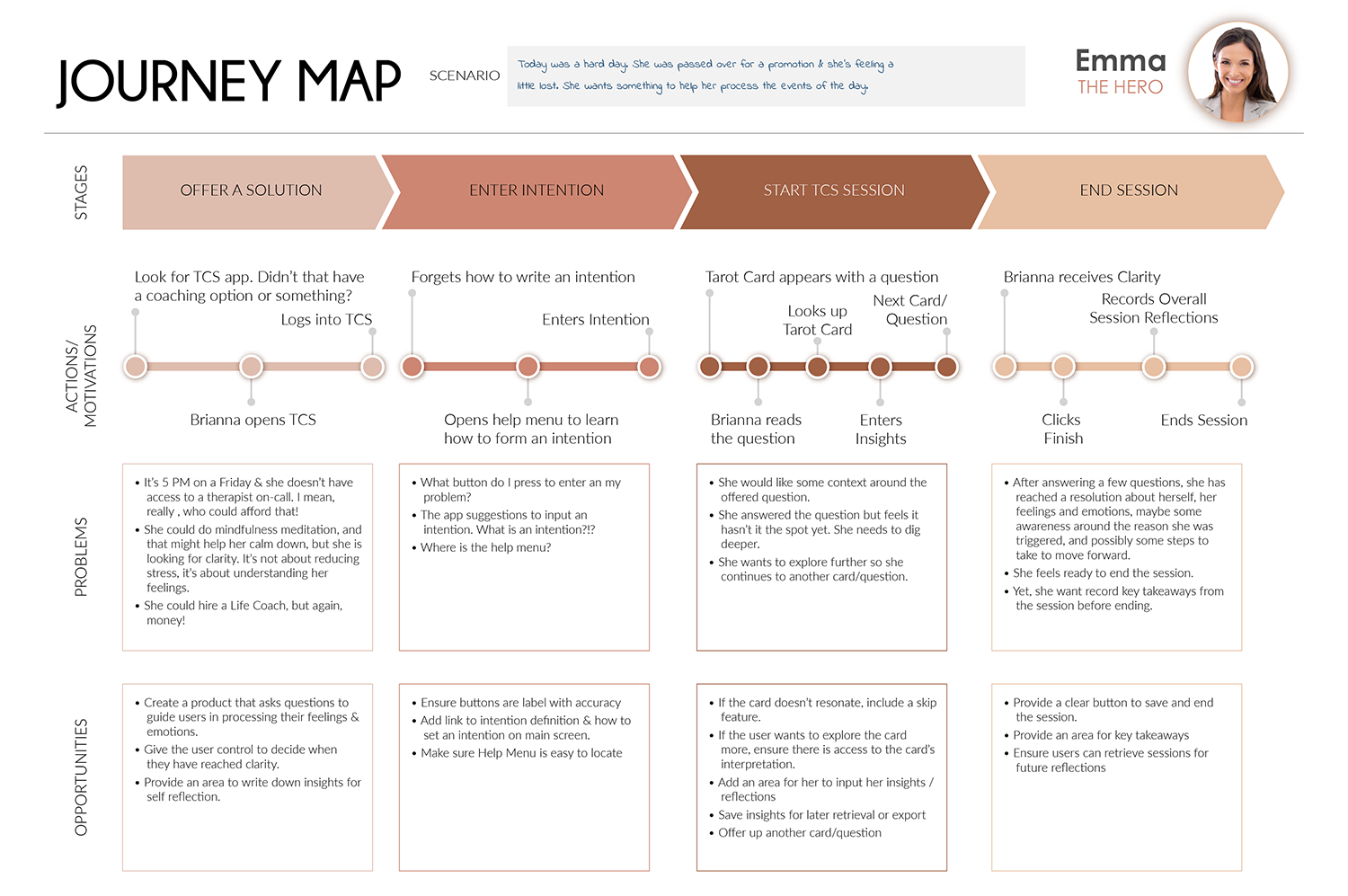
USER JOURNEY
OBJECTIVE
Take a single scenario and plan out the series of steps in which a user will interact with the product
Outcome
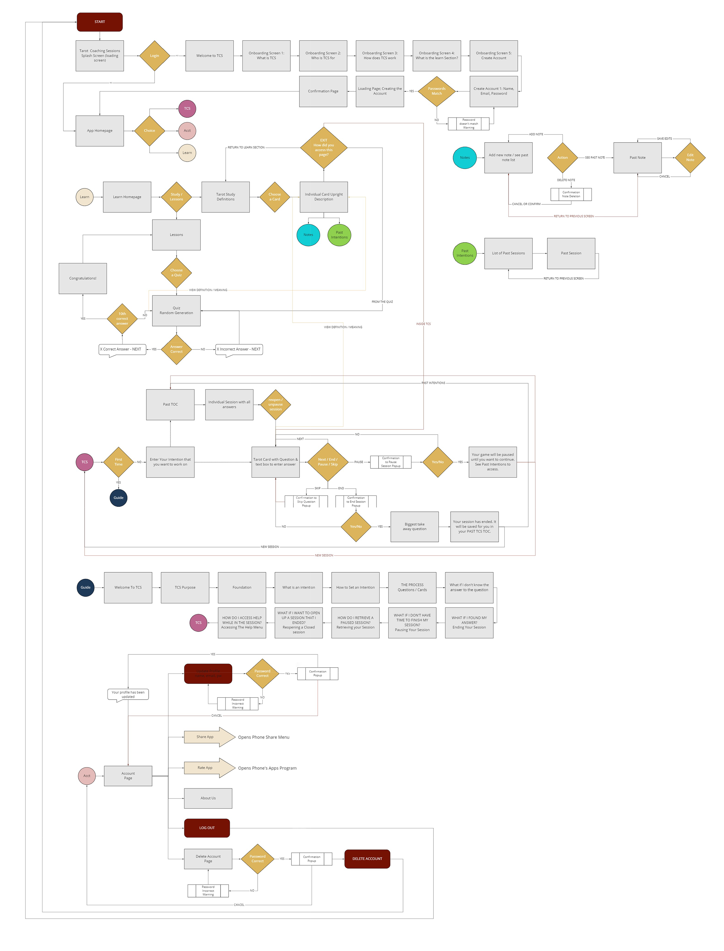
User Journeys are essential to ensure steps are not missed in the User Flow.
USER FLOW
OBJECTIVE
Highlight all the paths a user takes to all complete tasks
Outcome
A User flow was key to sketching out the first iteration of product design and highlighted the composition of each screen.
CONCEPT SKETCHES / 1ST INTERACTIVE PROTOTYPE
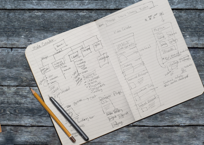
I hand-sketched a prototype of the product. Then using Marvel, I combined the screens into a lo-fidelity clickable prototype for the first usability tests.
Usability Key Findings
- Name of the App. ‘Tarot Coaching System’ became ‘Clarity through TarotTM‘
- Renamed Buttons. Add ‘Save’ to a few of the buttons
- Reworked the Iconography
- Added “Review Your Session” to the Big Takeaway Screen
- Re-labeled Sections to better describe the content of that section
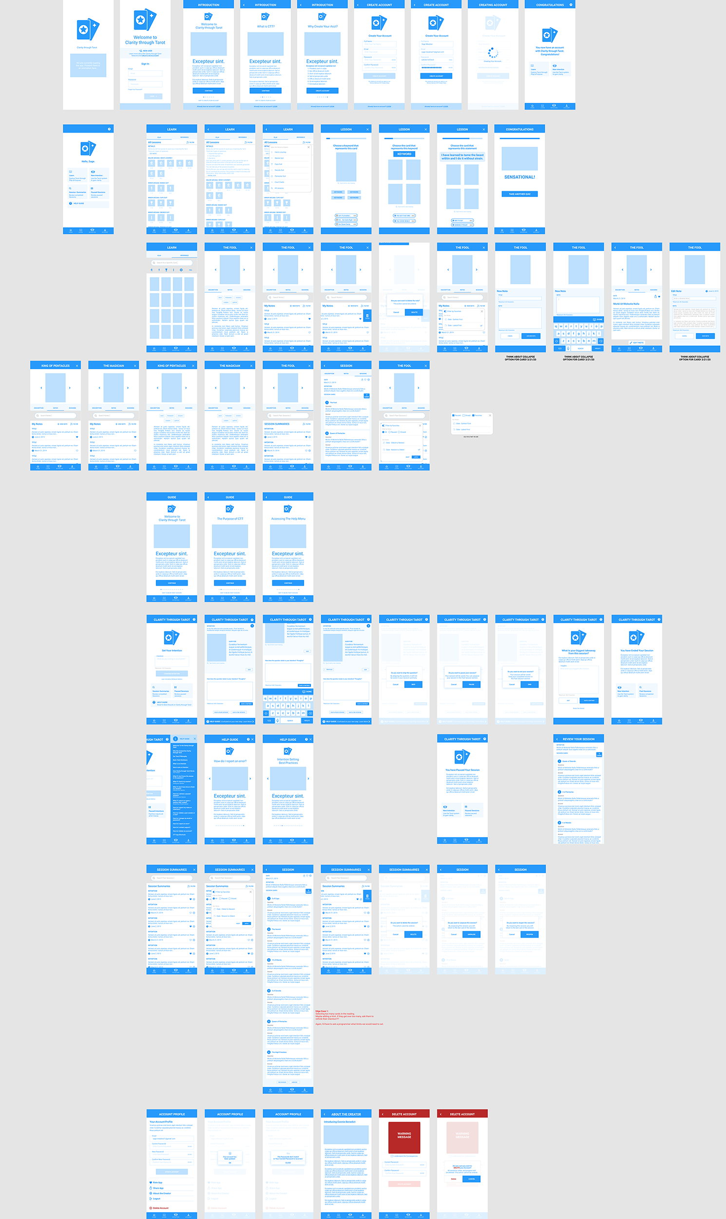
WIREFRAMES
OBJECTIVE
User test the flow and features before spending too much time on design
Outcome
In wireframe format, I was able to see the majority of the user interface (UI) components needed for high fidelity design.
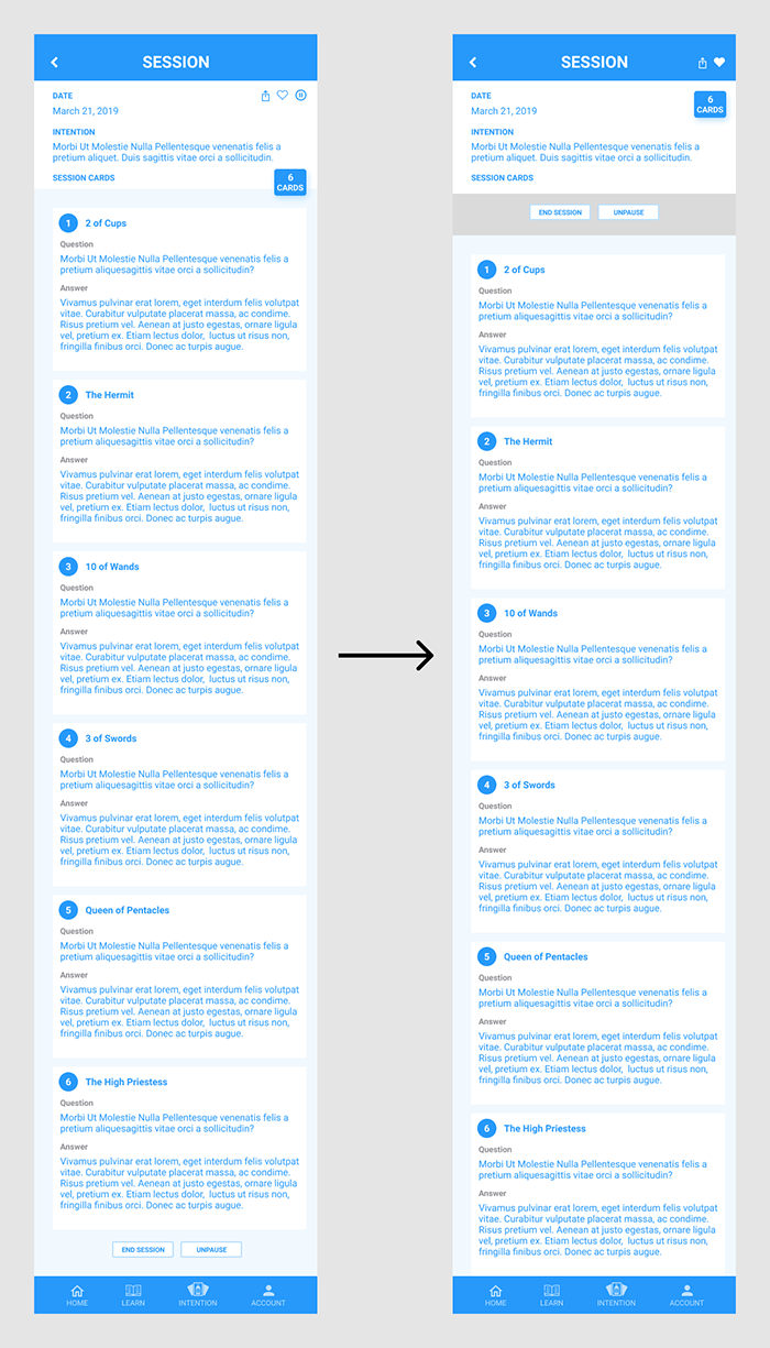
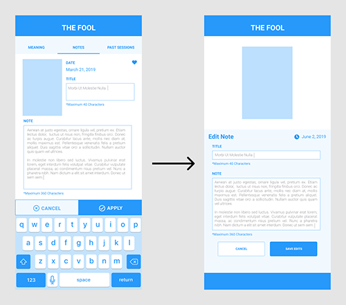
In usability testing, three main iterations became evident:
Iteration 01
Action buttons on Session Review Screen were moved to the top for easier access
Iteration 02
Editing Notes Screen was redesigned to accommodate the larger card, requested by users
Iteration 03
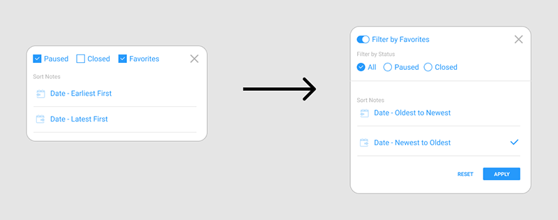
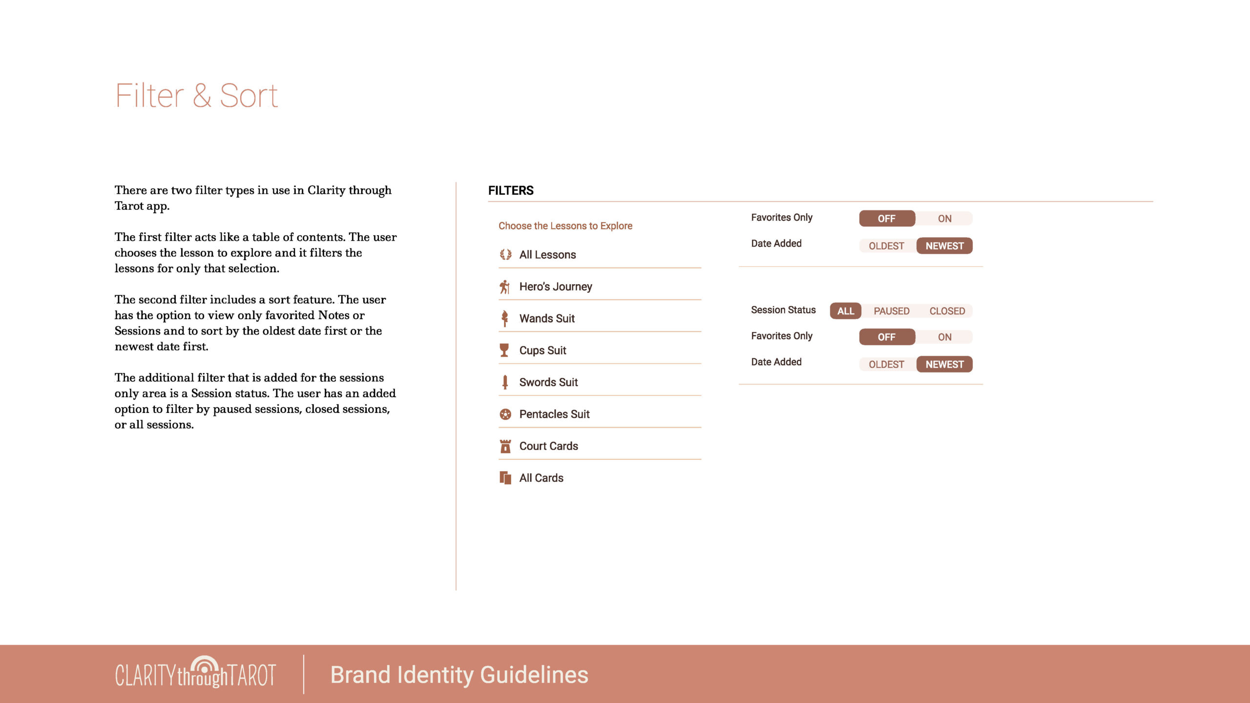
Filters were re-imagined due to confusion between sort & filter functions
PROTOTYPE SUMMARY
In Discover, I tested the viability of the product concept. In Define, I tested the product features. At the end of Prototype, I have working solution for the product.
DESIGN
BRAND PLATFORM
OBJECTIVE
Assemble the Product’s Persona to create a Brand
What Clarity through TarotTM Represents
Symbology, story, and attribution of meaning are key aspects of the Tarot. You will see these aspects at the forefront of this product’s look and feel.
Users expressed during user interviews that the Tarot is a tool they could use to better understand themselves and bring forth unconscious thoughts and beliefs into their conscious mind so from colors to typography, from spacing to ease of use; Clarity through TarotTM brand is the bridge of the unknown to the known.
Given my experience learning the Tarot, I wanted this brand to feel inclusive and inviting so that if you didn’t know anything about the Tarot, a user would feel welcomed and a part of the Tarot Community.
Product Name
The product name was refined during usability tests. The initial working title was Tarot Coaching System. However, the participants in the usability tests interpreted that name as a Tarot Course where they would be getting coached on how to read the Tarot. A user suggested renaming the product to Clarity through TarotTM.
I then tested that name in subsequent usability tests and it landed accurately with the purpose of the product.
Projects Goals
Project goals remain the same. They are relisted below for continuity.
- INTRODUCE: Acquaint a wider audience to the Rider-Waite-Smith (RWS) Tarot with a focus on Jungian archetypal images
- FUN: Create an interactive, educational, enjoyable, accessible, and easy to learn product
- INSIGHTS: Provide a format that supports users to reach clarity around an intention; without having to know the Tarot
- TRANSFORM: Cultivate an opportunity for life-changing experiences that awaken users to a more satisfying life
Brand Personality
Clarity through TarotTM is meant to be a fun, inspirational, enjoyable, and an easy to access Tarot mobile product that goes beyond learning the tarot or memorizing the cards. It’s about applying the Tarot to create personal transformation.
Clarity through TarotTM is meant to be stimulating, engaging, and consciously awakening. Users should be able to experience aha moments, moments of clarity, and insight; moments that generate a deep self-understanding where personal patterns are broken and new beliefs are conceived.
Clarity through TarotTM should be a place where perception is challenged and rebirthed to see a refreshed way of being. Clarity through TarotTM is designed to be that self-development tool that pulls the unconscious to the conscious for users to activate breakthroughs.
Brand Attributes
- Keywords: Clarity, Enjoyable, Engaging, Inspirational, Easy to Access, Transformational
- Usability Tests Feedback: lighthearted, refreshing
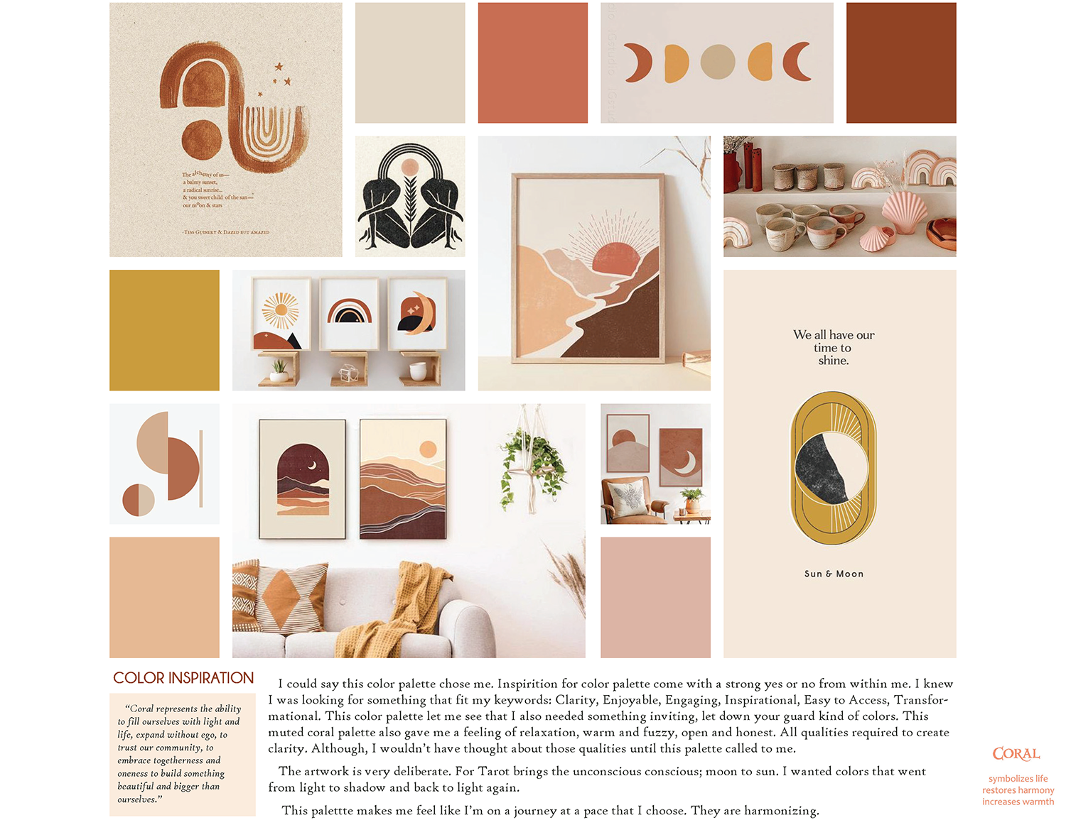
MOOD BOARD
OBJECTIVE
Gather visuals that align with the Brand Platform & connect with the potential audience
Color & Emotion Exploration
I used the following keywords and phrases to locate images, photographs, and colors that represented the Clarity through TarotTM personality:
Inviting; Authentic; Modern; Open & Honest; Active, yet subtle; Alive, yet at ease; Invoke Warmth; Foster Inspiration
BRAND IDENTITY
OBJECTIVES
Create a look that:
- Upholds the Product Personality
- Connects with the Users
- Uniquely identifies the product
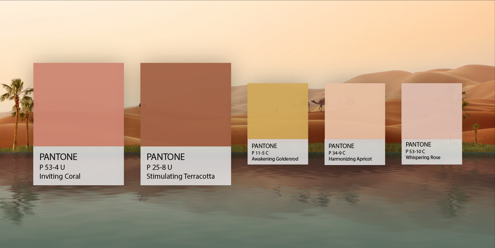
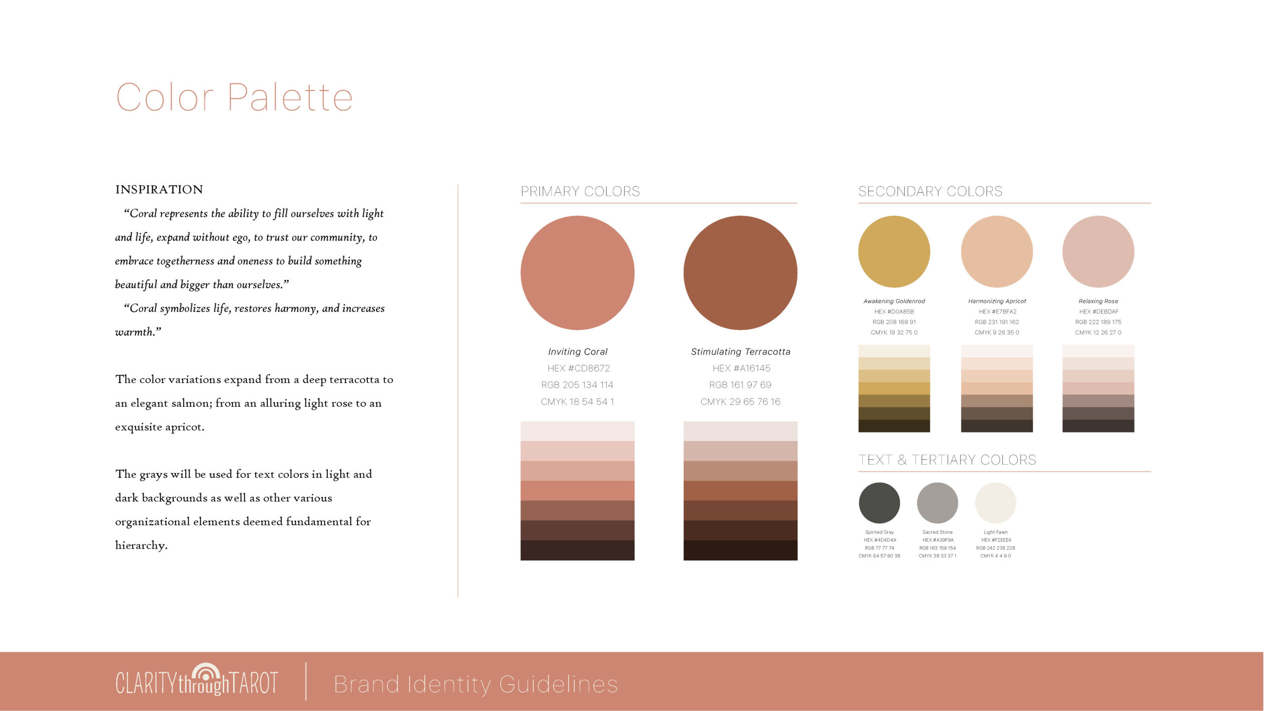
Color Palette
“Coral symbolizes life, restores harmony, and increases warmth. It represents the ability to fill ourselves with light and life, expand without ego, to trust our community, to embrace togetherness and oneness to build something beautiful and bigger than ourselves.”
I couldn’t have found a more appropriate color to represent the brand personality of this product.
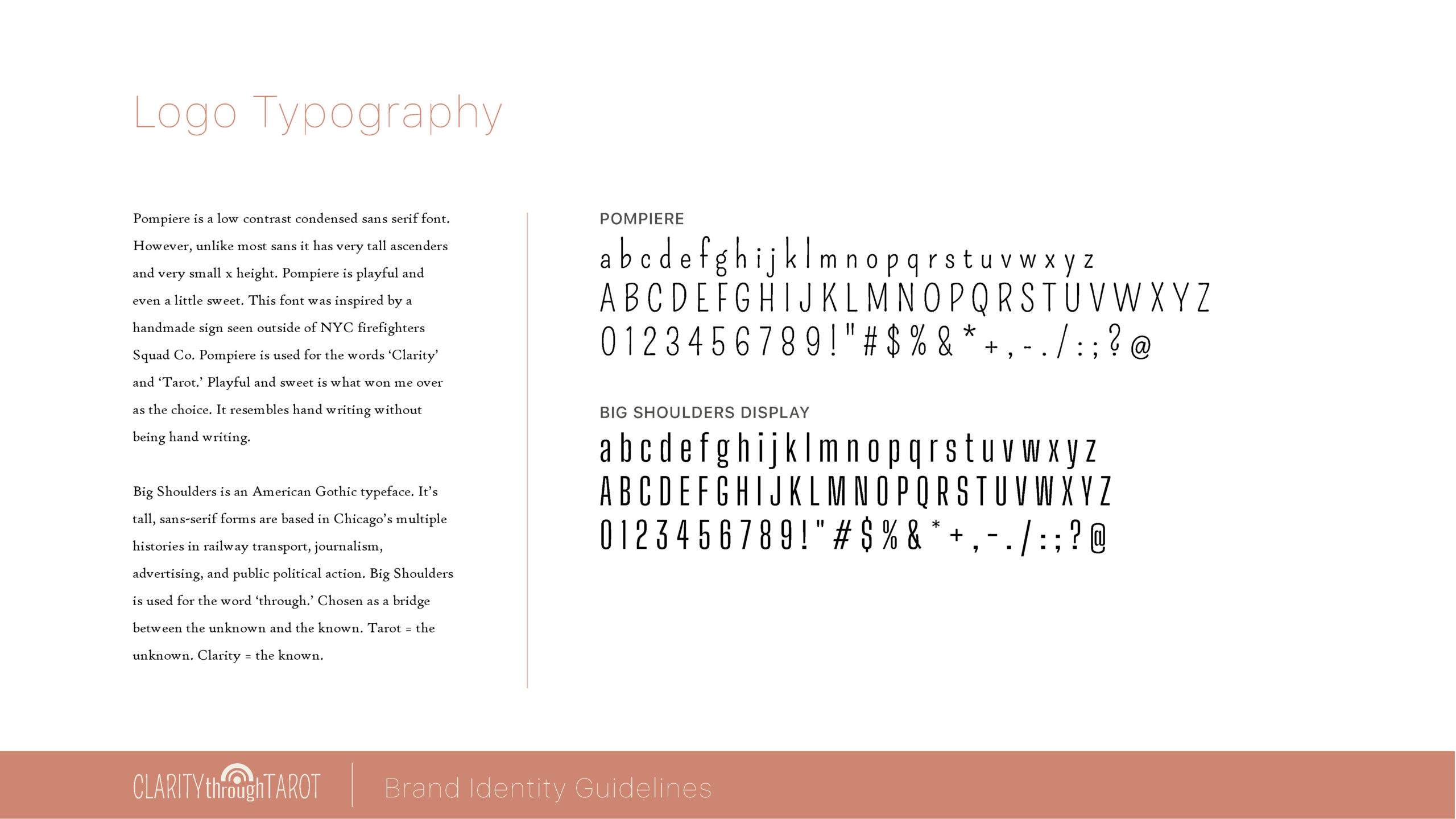
Typography
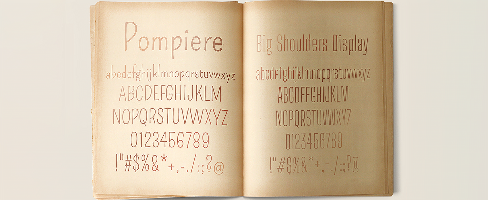
There were two characteristics I wanted in the logo typography:
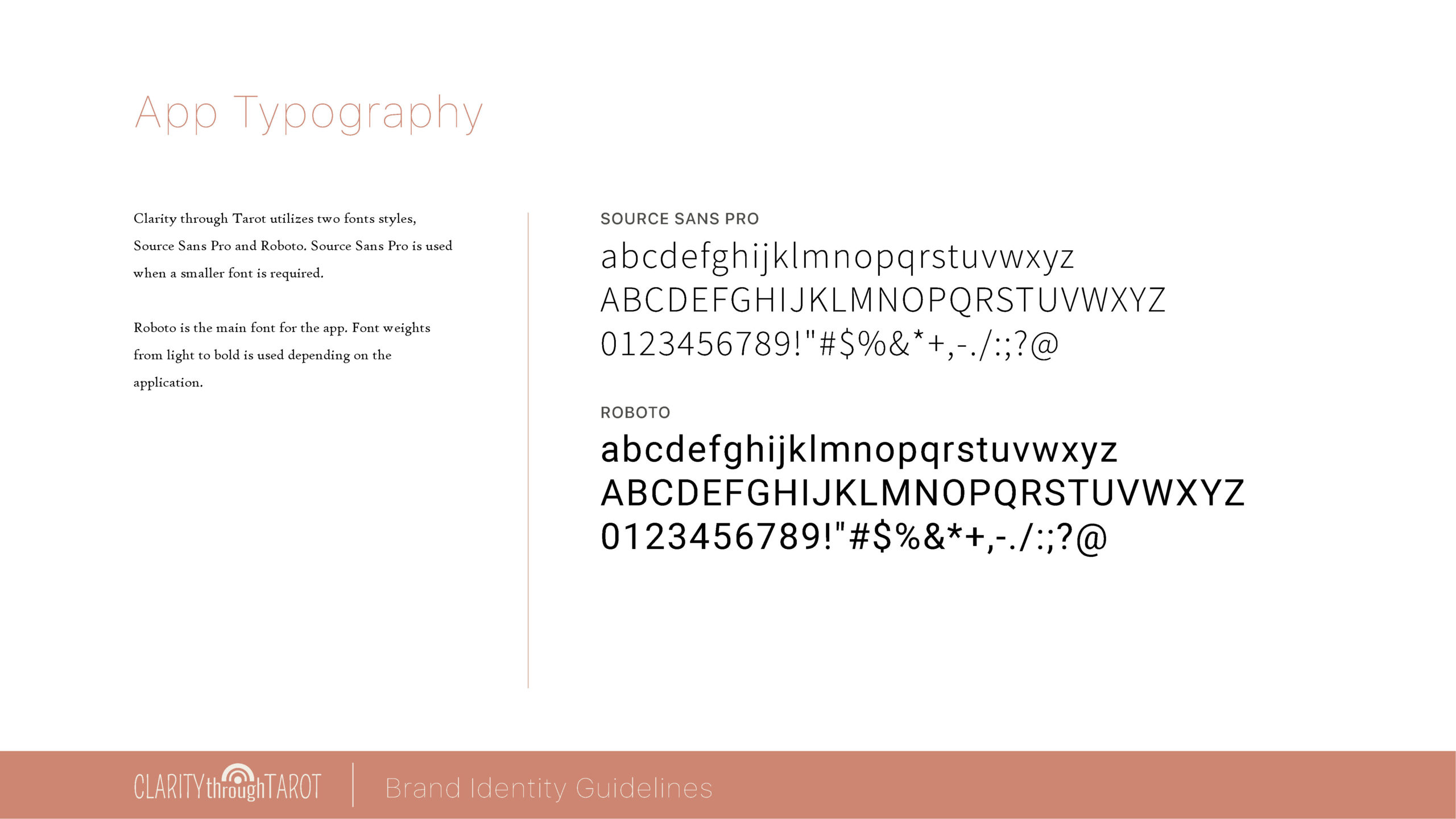
- Eclectic San Serif: A traditional Sans Serif or Serif font would be too formal. I wanted a San Serif that subtly resembled handwriting without being handwriting for the welcoming feel. (Pompiere)
- Compact: A long product name required a readable compact font. (Pompiere, Big Shoulders Display)
Symbols & Symbol Psychology
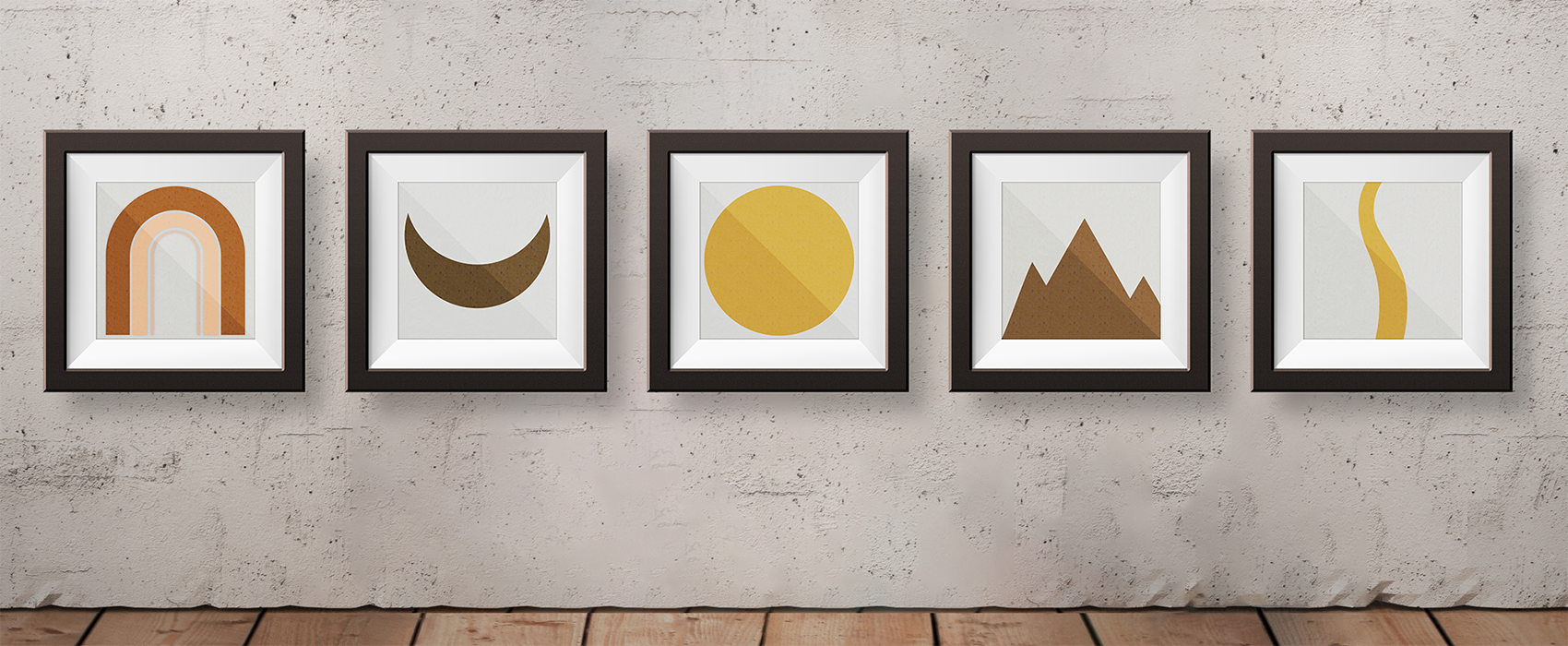
True to the Tarot as a symbolic language, I began by gathering symbols that embodied the keywords in the brand personality.
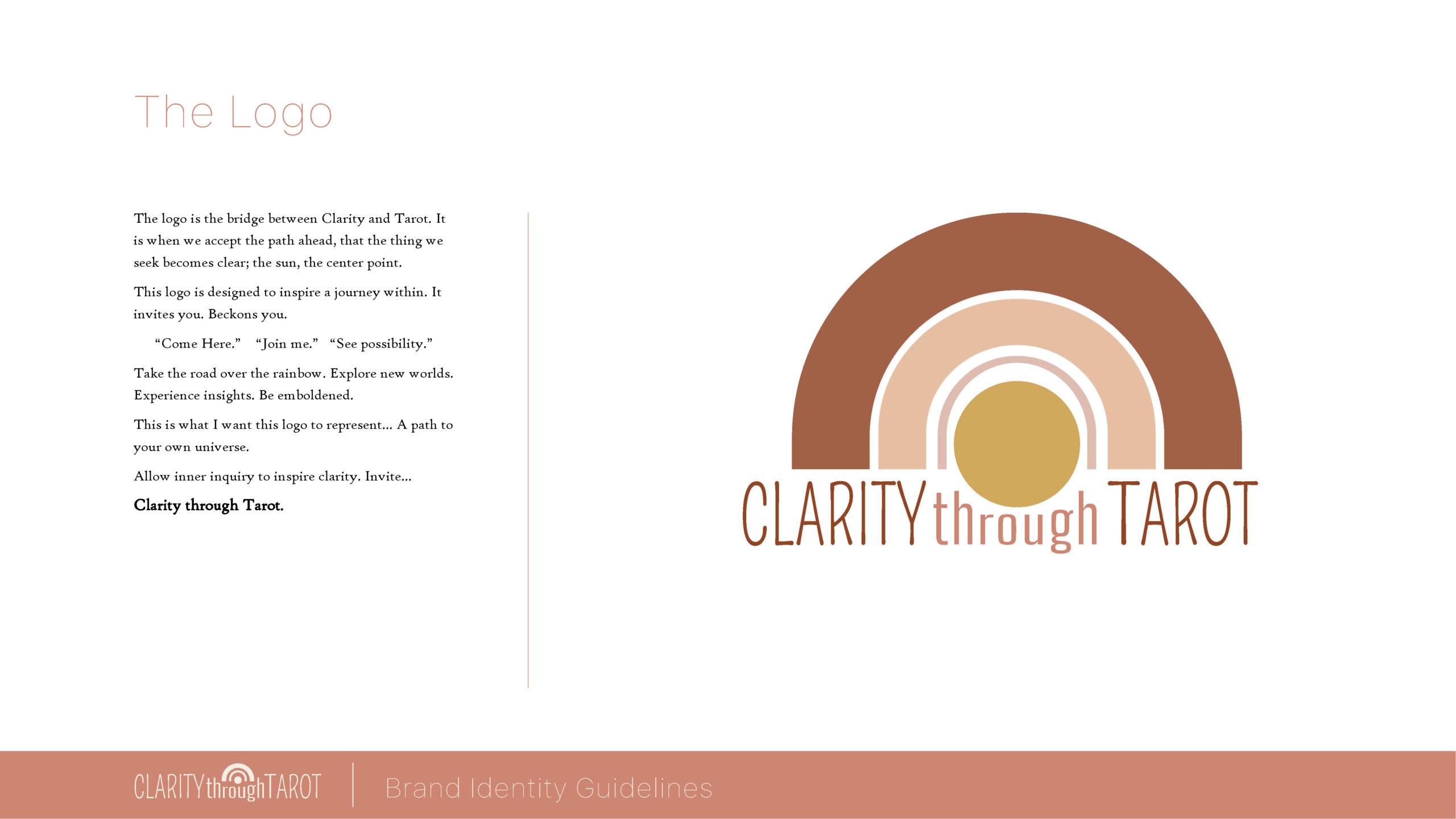
Rainbow
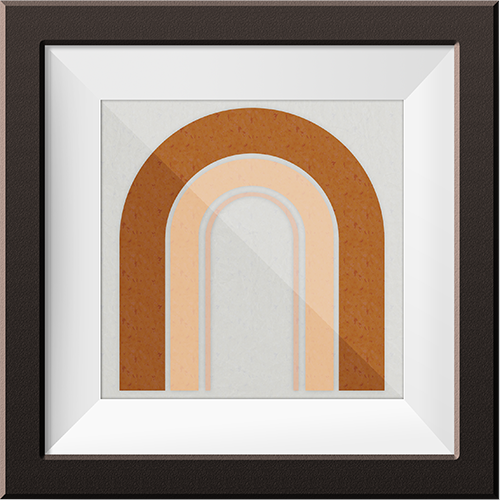
This was the key element that brought it all together. Rainbows activate Inner Awakening. For some people on a spiritual path, the appearance of a rainbow can signal a spiritual inner awakening. This process of waking up to the spiritual realm holds promises of new knowledge and truths. It is a sign of hope and promise.
Sun
Sun represents the light, consciousness, the knowns, and clarity. It is a symbol of origin that represents the completing of the Great Work. It represents life, influence, and strength. The sun also symbolizes energy, will, and Self. I knew from the start that the Sun was vital in the design.
Moon
Moon represents the dark, unconscious, the unknowns, and illusion. When we are lost, confused, or bewildered, we must shine a light into the darkness to shed truth on illusion. When the moon reflects the sunlight, it mirrors back to us what we must see in order to transform. It symbolizes the unconscious awakening into the conscious.
Mountain
Mountains are thought to contain divine inspiration. The mountain peak symbolizes a state of absolute consciousness. They represent that depth of our psyche. They are a symbol of the obstacles we must overcome to reach our destiny.
The Brand Story
- When the first ring of the rainbow hits, truth is what we seek. It is the darkest part of the rainbow, the part where the truth lies, in our unconscious.
- As the second ring appears, knowledge is born. We’ve accepted the quest and through each new question, we are learning.
- As the third ring appears, wonder is activated. Wonder is a state of emotion that promotes creative awareness allowing intuition the freedom to serve you best in perceiving something unexpected. Wonder is linked with curiosity and the drive behind intellectual exploration.
- Now let’s stop there. What else do you see? Do you see a corridor? A tunnel? Layers? Do you see how we were first at the surface but now we are diving deeper into the unconscious? With each ring, this logo invites you to go deeper.
- The sun rising, showing that we are close but not yet there. There is no way to get to the sun.
- The moon is hidden in the sun because they are united. True individuation comes from the two aligning as one. The moon moves to its own position as we explore the regions of the shadow; the illusions that block our truth.
- The mountains rise symbolizing the depths we must visit and the peaks we must climb to reach a conscious awakening of what we seek.
- The path is lowered by the sun, lighting the way to true Clarity! The golden rod. (hence goldenrod as the color)
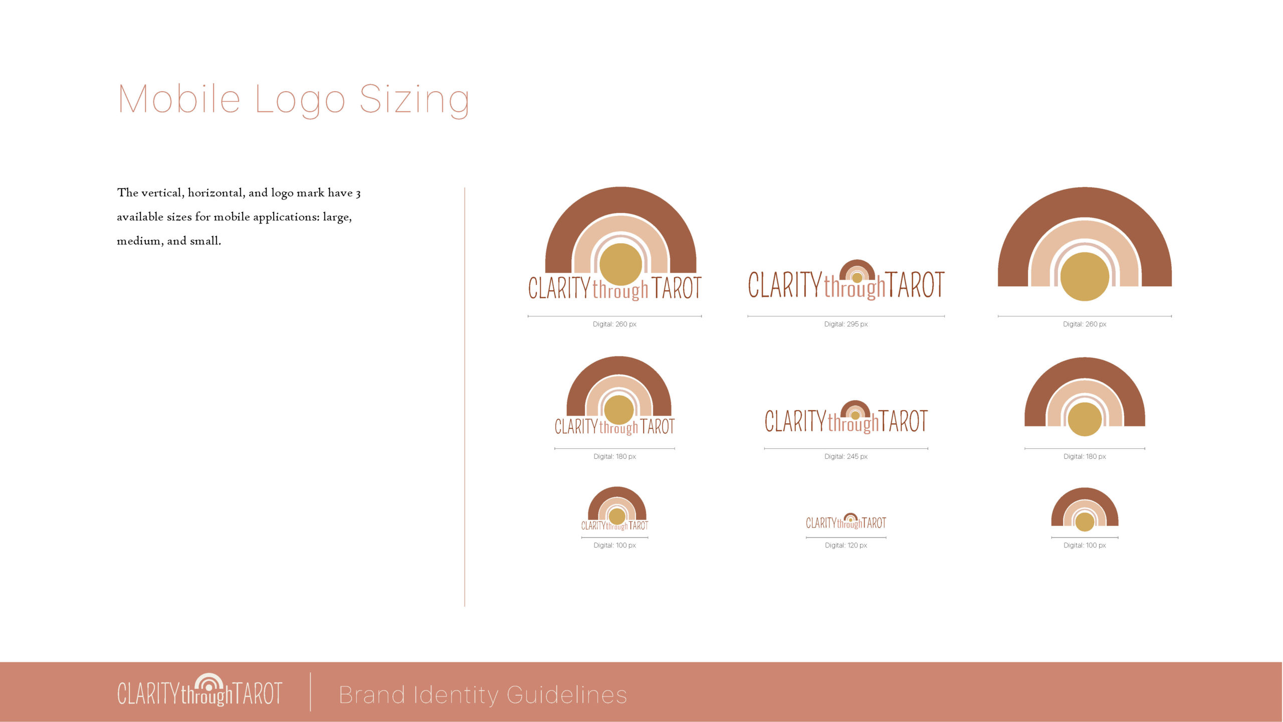
It is from here that the logo is born. The invitation presented to us from the layered rainbow leads us to the clarity we seek.
STYLE GUIDE
OBJECTIVE
Create a reference document that combines all brand elements to review during design
DESIGN SYSTEM
OBJECTIVE
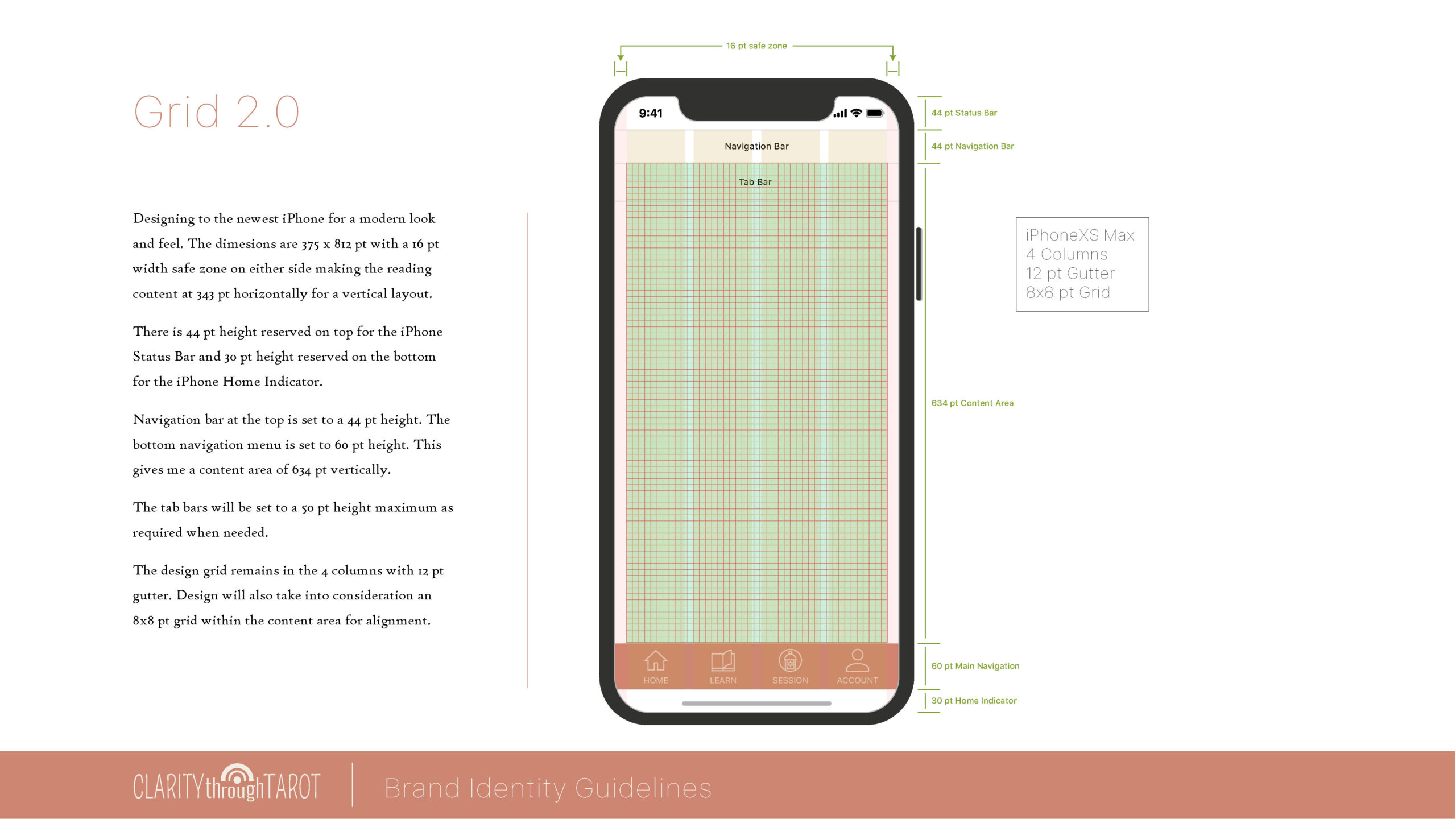
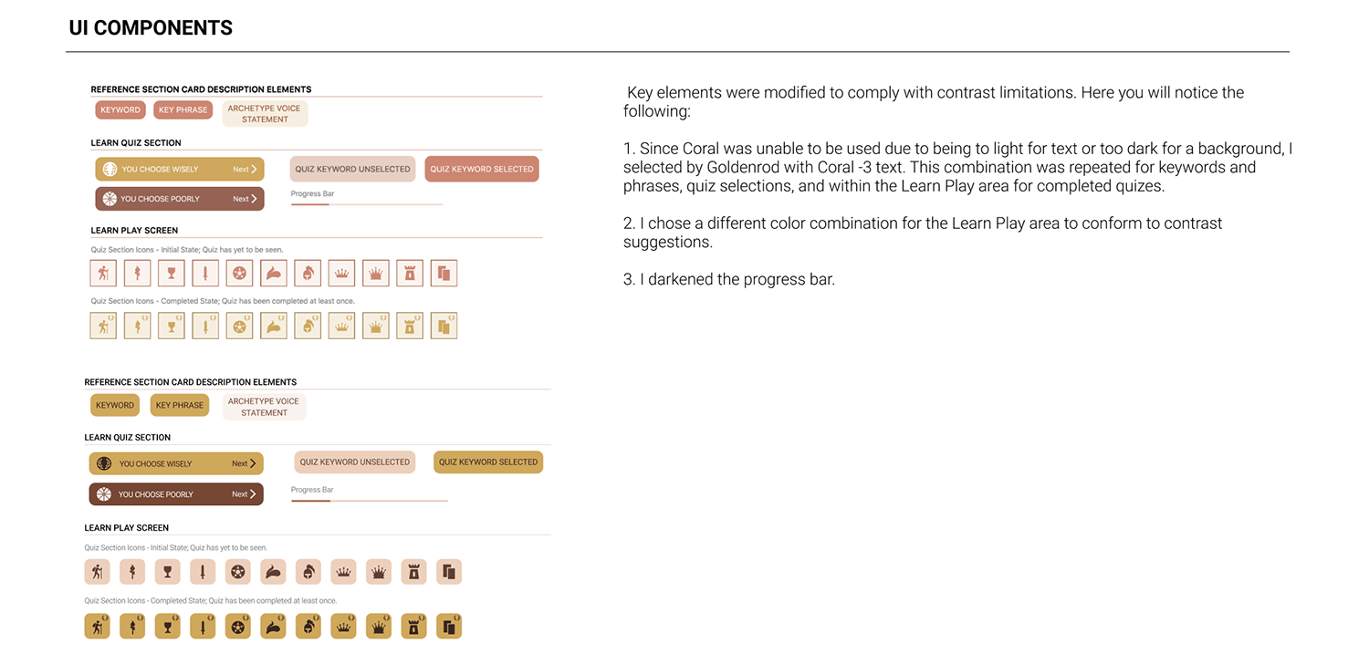
Create a reference document that combines all UI guidelines and components to review during designing
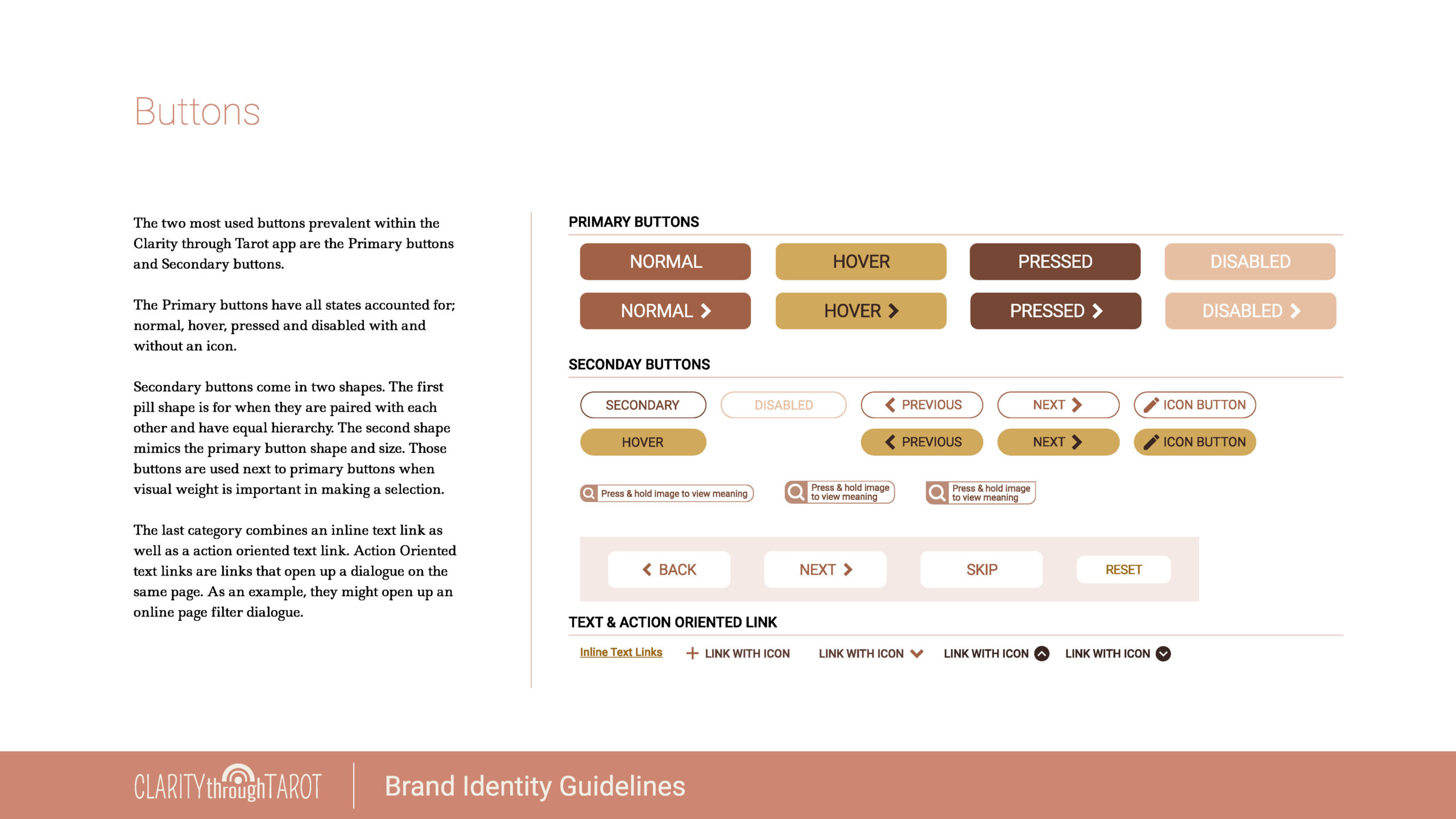
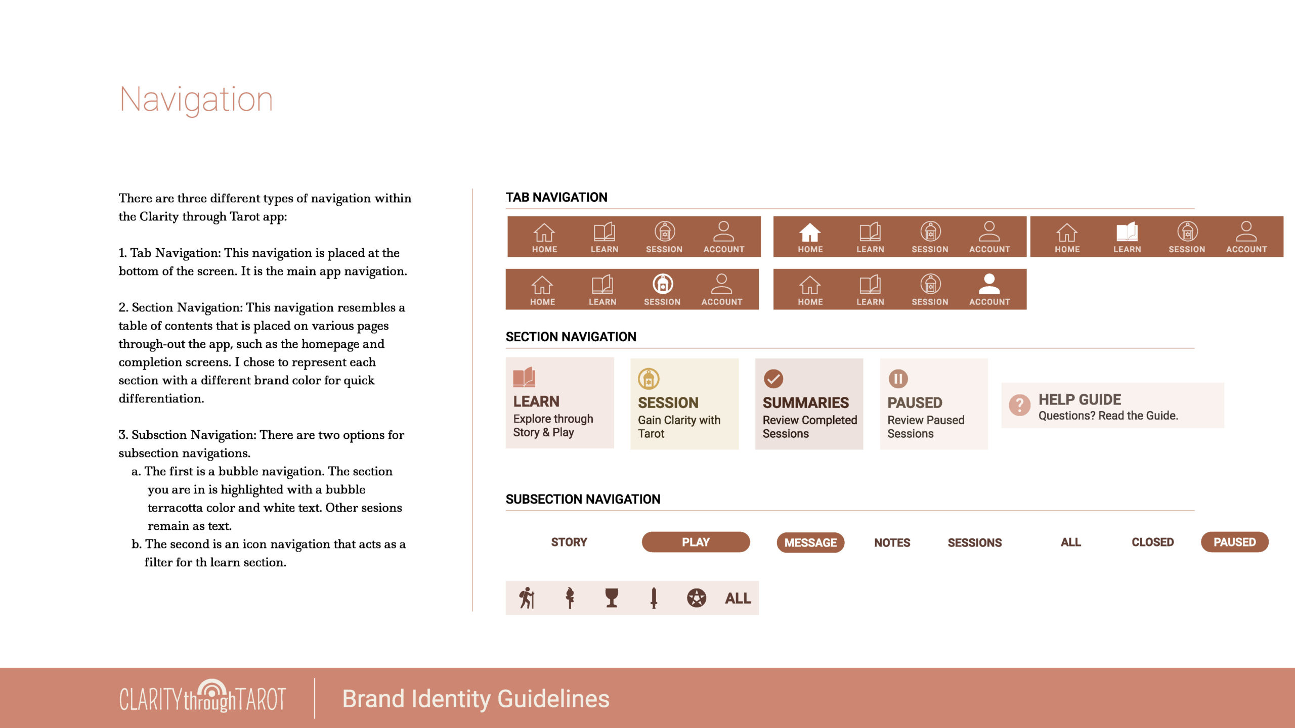
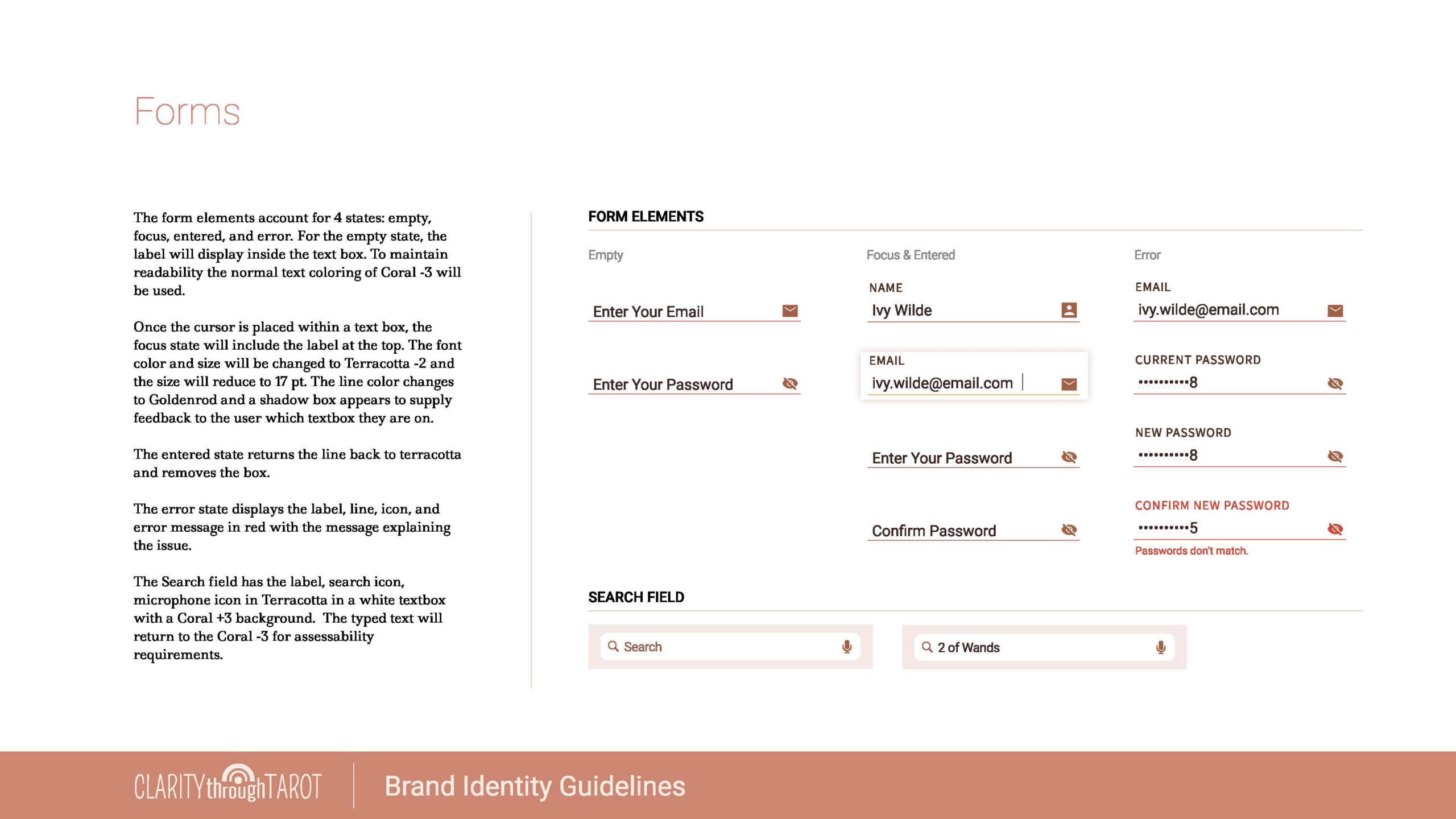
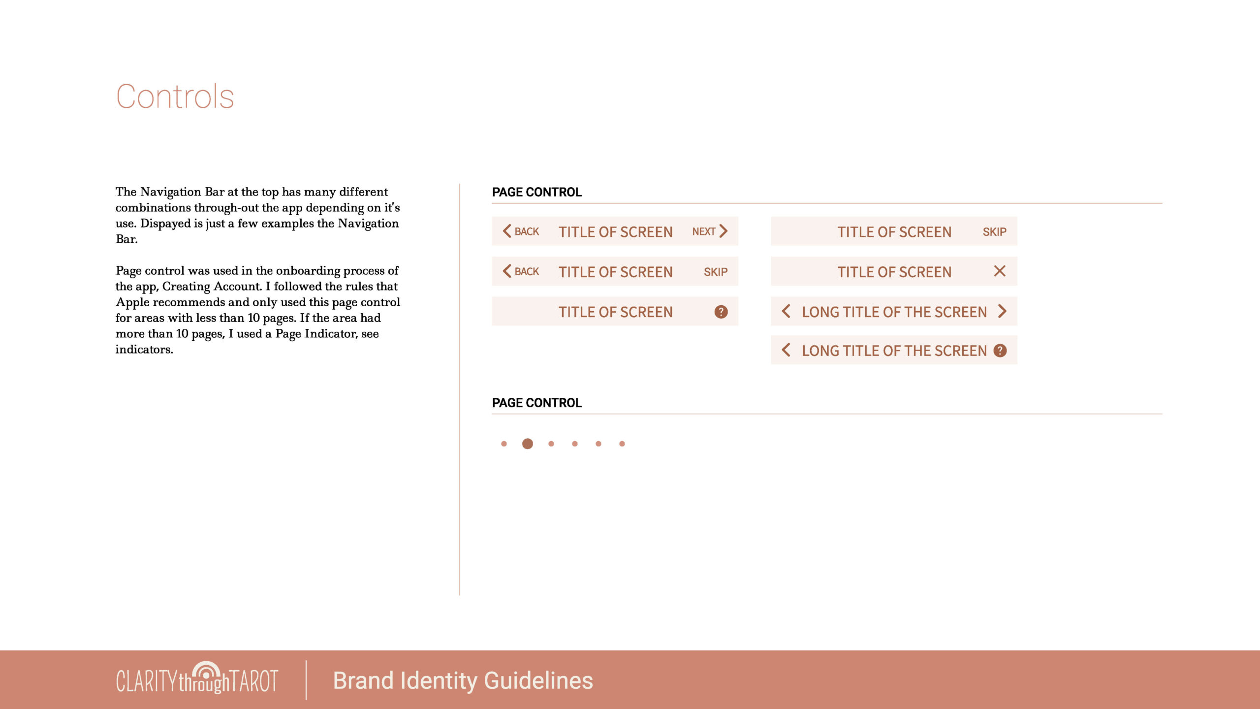
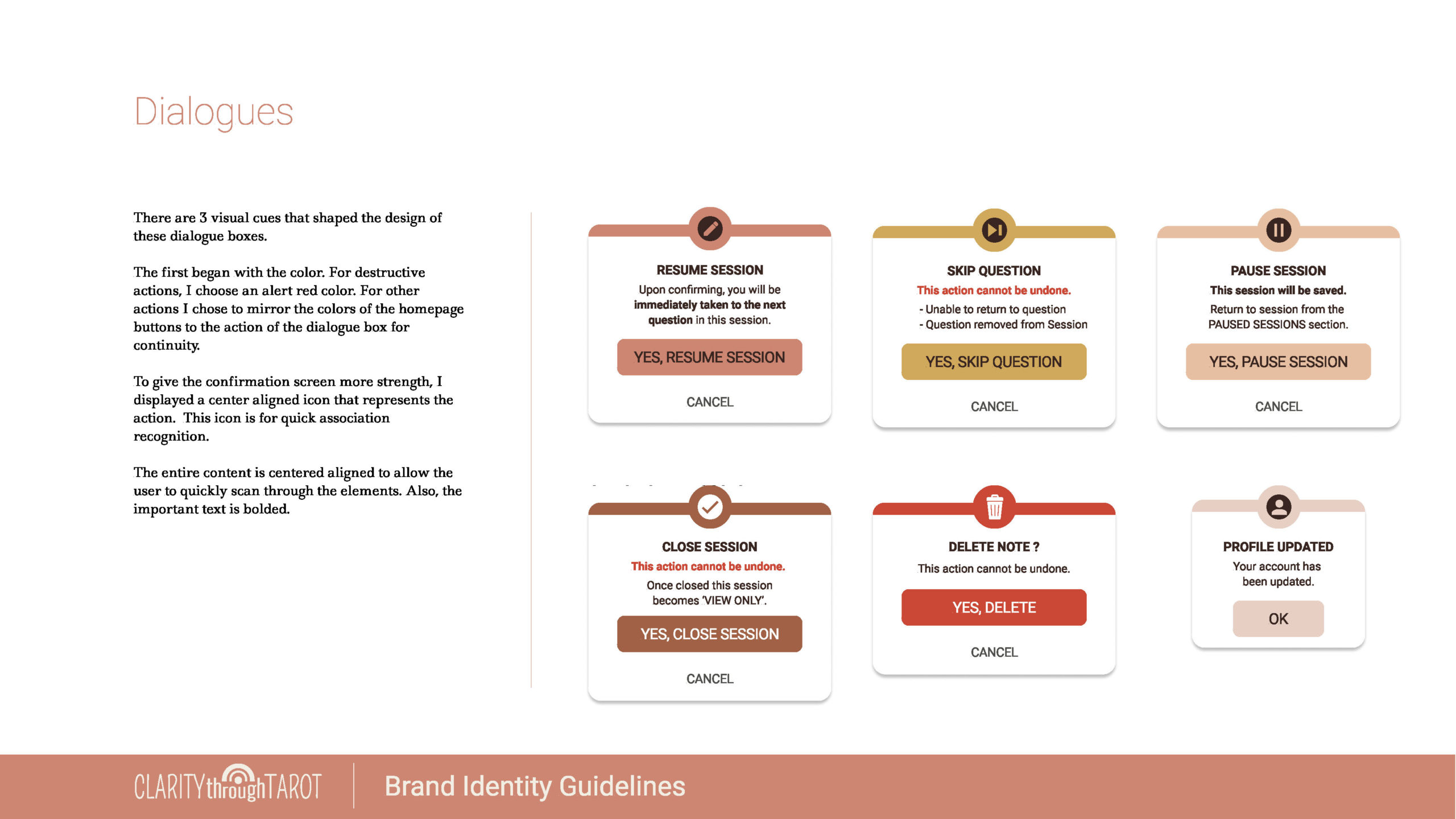
The Design System was developed in Figma and used to make all Figma components for faster design.
ACCESSIBILITY AUDIT
OBJECTIVE
Ensure Accessibility Compliance
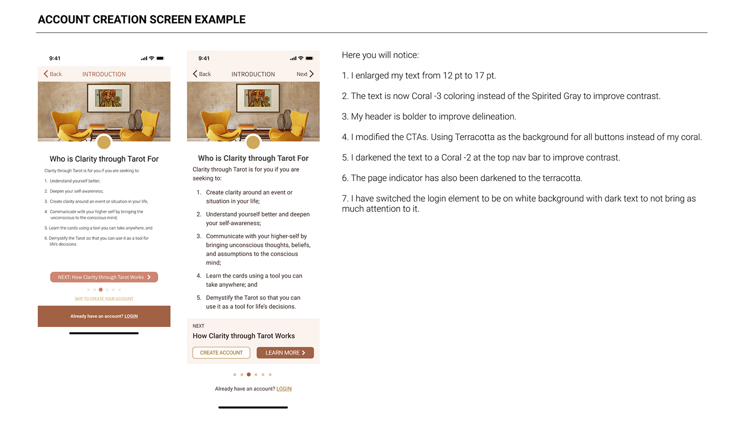
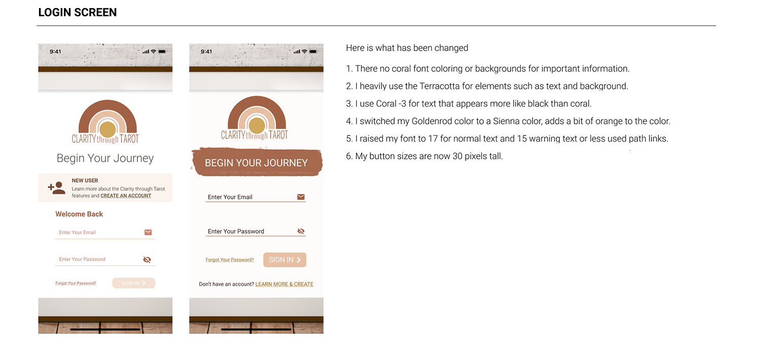
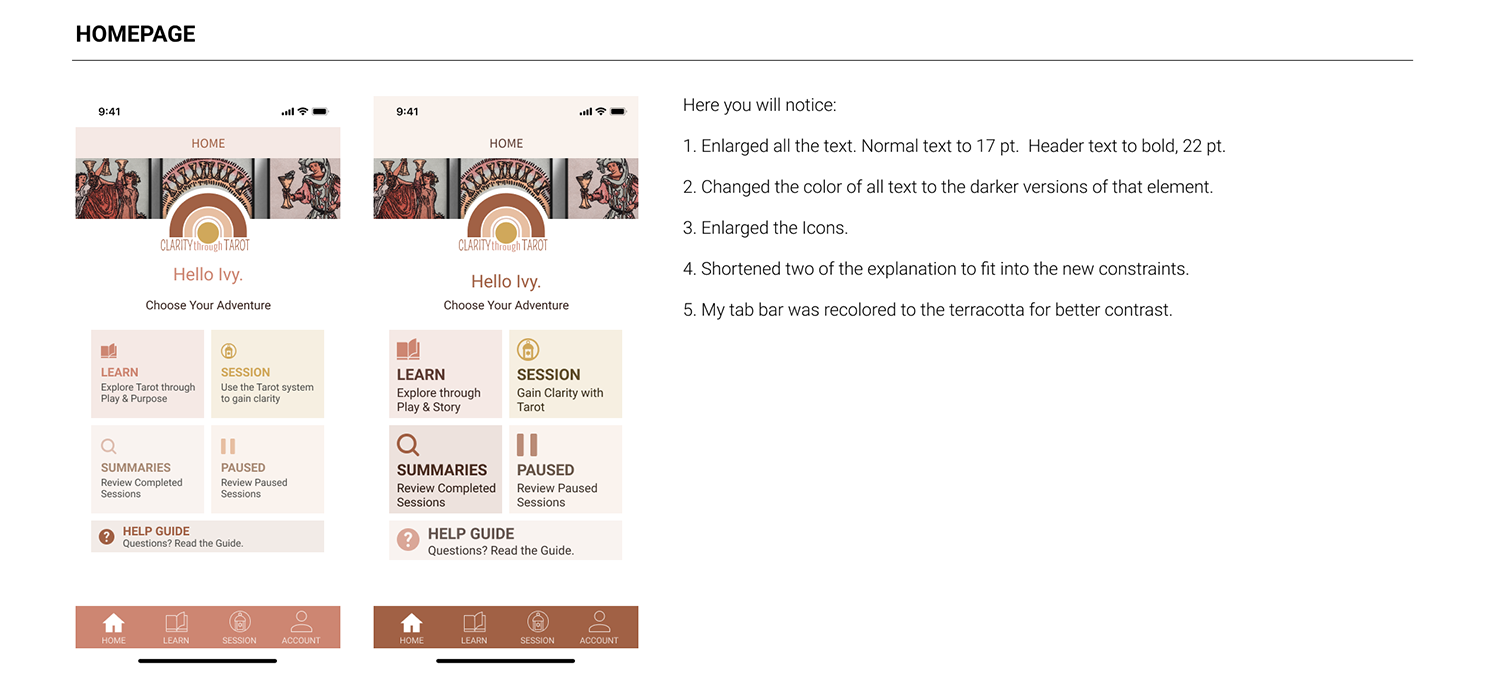
Accessibility Audit was completed on the first version of high-fidelity product design. These screens were further modified in usability testing.
HIGH FIDELITY DESIGN
OBJECTIVES
Create Final Stage Product for Usability Testing
Aesthetics were united with wireframes to ensure design continuity and prepare the product for user testing.
INTERACTIVE PROTOTYPE
OBJECTIVE
Link all design screens for interactivity
Initial Prototype
The initial prototype is completed in Figma and used for the first round in usability tests. Please note that not everything is linked as this is a working graphic prototype. You must first create an account to access the homepage. Click on the screen to see blue boxes that will highlight what is clickable on the prototype. If you get lost, press R to restart.
DESIGN SUMMARY
In the Design Stage, the Brand Platform and Identity were created, aesthetics were merged with the wireframe, the design system was built, and accessibility standards were addressed culminating in an interactive initial prototype to be used in the Test Stage.
TEST
USABILITY PLAN
OBJECTIVE
Prepare for and provide a professional and organized usability test
Plan Highlights
Ideal participant characteristics were clarified and participants were recruited through my network. A testing script with an introduction, scene scenario, 9 tasks, and wrap-up questions was employed.
Five top-level items were tested:
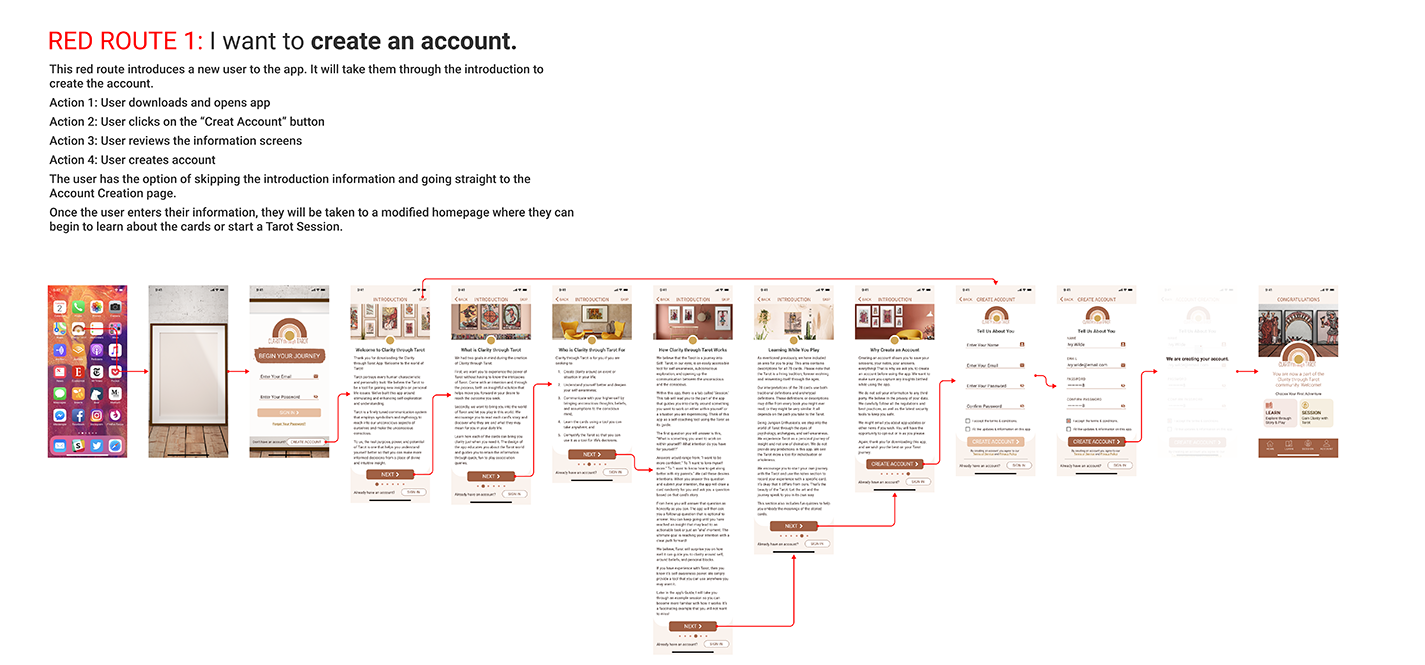
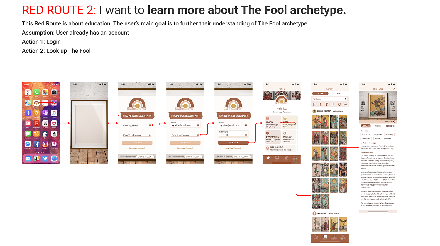
- Product Red Routes
- Observe paths users take to complete tasks
- Validate the Information Architecture
- Discern Cognitive Load of the design
- User comprehension of product and its primary purpose
USABILITY TESTS
OBJECTIVE
-
Record common user issues and iterate design for next usability test
-
Validate Product
Usability Test Results
Round One: 5 test sessions with 8-10 tasks completed per session
Critical Items requiring Iteration:
- Onboarding & Introduction to Tarot Session Guides were not valued as presented
- ‘Create Account’ button was not easily located
- Terminology in the Learn section was confusing
Round Two: 5 test sessions with 8-10 tasks completed per session
New issues came to light in the Learn and Play sections as well as with the sign-in button.
MINIMAL VIABLE PRODUCT (MVP)
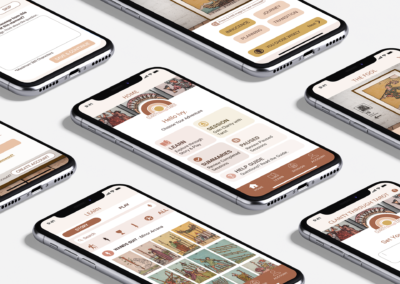
Below I walk you through the main features for the Clarity through TarotTM MVP.
OnBoarding
FEATURE
A quick tutorial on the features within the Clarity through TarotTM product. Quick tips can be skipped if desired. Quick tips can also be accessed through the Help Guide inside the product.
Programming Considerations:
Anticipate if they are a new user or a returning user. Show the appropriate screen for either sign-in or create an account.
Future Considerations:
Add a focused PLAY tutorial screen that explains further the PLAY section.
Tarot Session
FEATURE
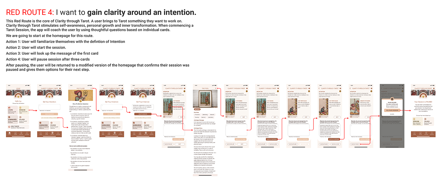
Tarot Session is a coaching-based feature that uses the Tarot archetypes to ask questions to the user. The user inputs an intention at the beginning of the session to focus the Tarot Session. For MVP, the limit is 11 cards per session. However, the user can close the session after 1 card, if desired.
Suppose a question doesn’t resonate with a user, no problem! The user skips the card and the product will choose the next Tarot archetype/card to display, at random. After the user answers the question, they have three options:
- Save & Continue: Advances user to the next Tarot archetype/card.
- Save & Pause: Pauses the Tarot Session to access later, saving their answers and cards for later retrieval and Session continuation, if desired.
- Save & Close: Closes the Tarot Session. A Takeaway question will appear, which they can skip if desired. After closing the session, a user can review it but will be unable to edit it.
If the user wants more information on the Tarot Archetype while in the session, they can click on the card image to view the archetype’s information.
Future Considerations:
- Add thought bubbles above buttons to help users choose a call to action (CTA).
- Redesign the “Press & Hold” interface tip.
*This video demonstrates a user pausing their Tarot Session for later retrieval.*
Learn Section Filter & Search
FEATURE
The Learn Section displays all 78 cards from the Rider-Waite-Smith (RWS) Tarot deck. Due to the number of cards, an easy filter navigation was created for quick access to particular cards in the varied suits.
Also included was a search option.
ABOUT THE DECK
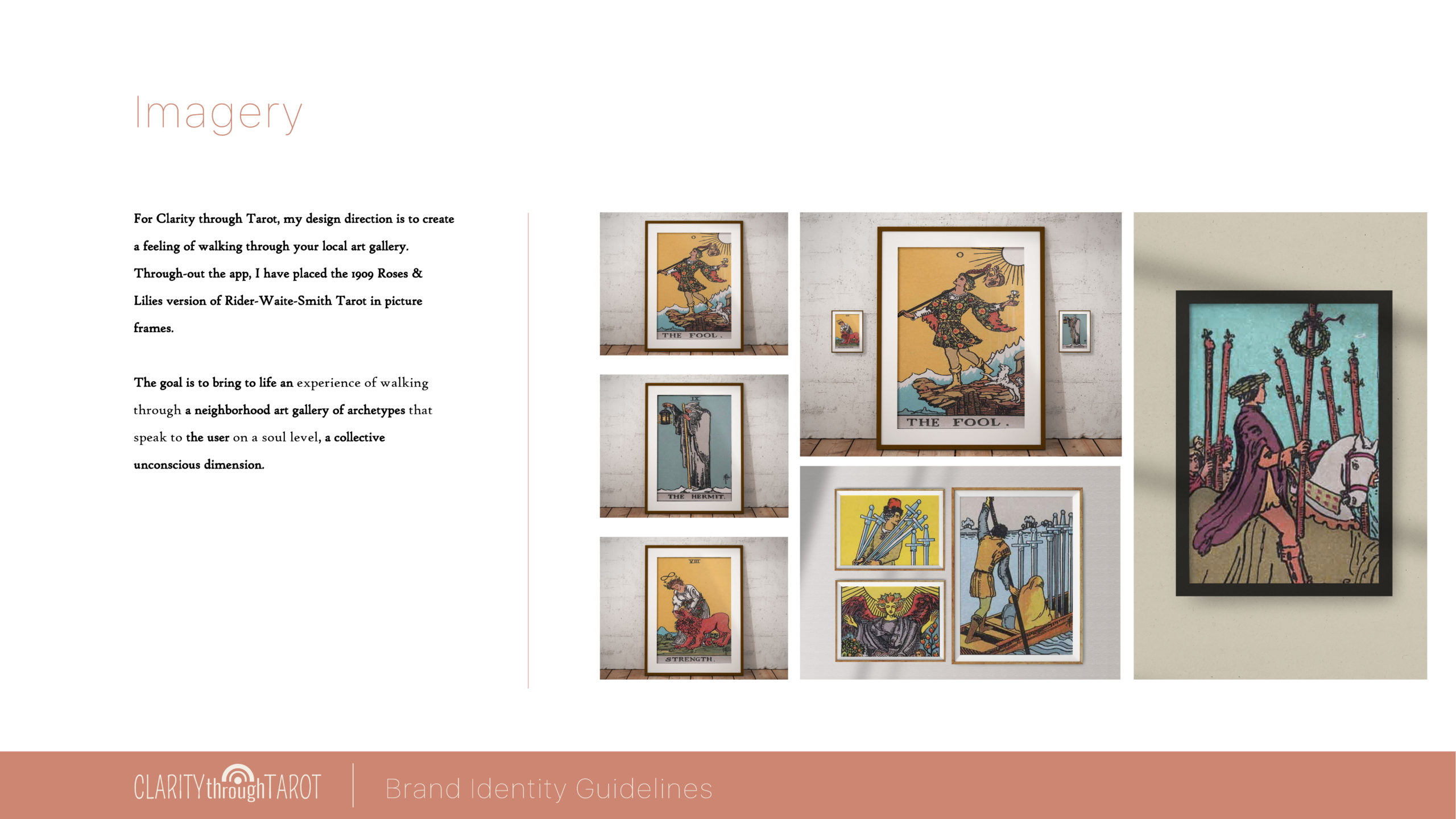
Illustrator Pamela Colman Smith drew the cards from academic and mystic A E Waite’s instructions. The deck was originally published by the Rider Company. Clarity through TarotTM uses the illustrations from the 1909 Pamela A version with the Rose-n-Lilies back.
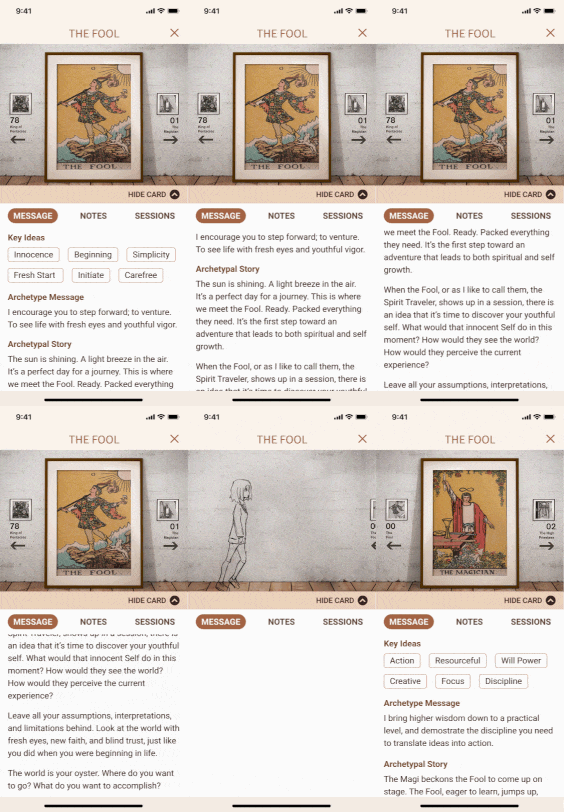
Tarot Archetype / Card – Hide Card
FEATURE
Hiding the Card allows the user to gain valuable screen real estate for reading the Tarot archetype/card’s information.
Future Considerations:
- Allow users to add their own description below the Archetypal Story.
- Allow users to customize the Key Ideas, adding keywords or key phrases for a more personalized experience.
Navigation Between Cards
FEATURE
Keeping with the Art Gallery/Museum brand ambiance, the navigation was made to feel like directional signs to the next art piece.
Future Considerations:
Fun Animation between cards – for fun, I animated a transition to spark creative ideas.
Add, Edit, & Delete Notes
FEATURE
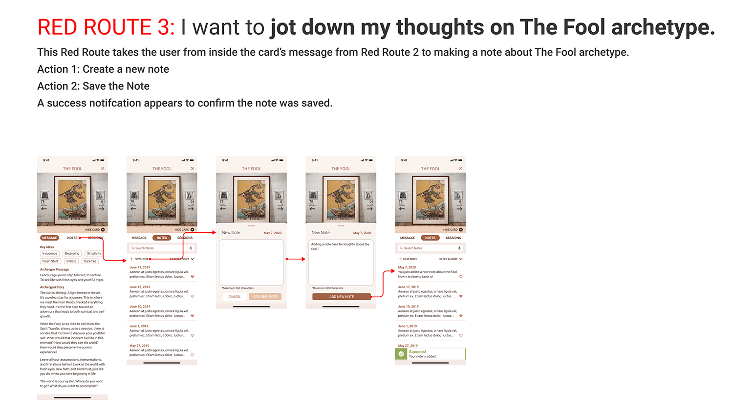
One of the goals for Clarity through TarotTM was to allow the user to capture personal experiences with the archetypes. The Notes Section gives the user an opportunity to record their own thoughts about the Tarot Archetypes or any insights that arise from the study of the Tarot Archetype.
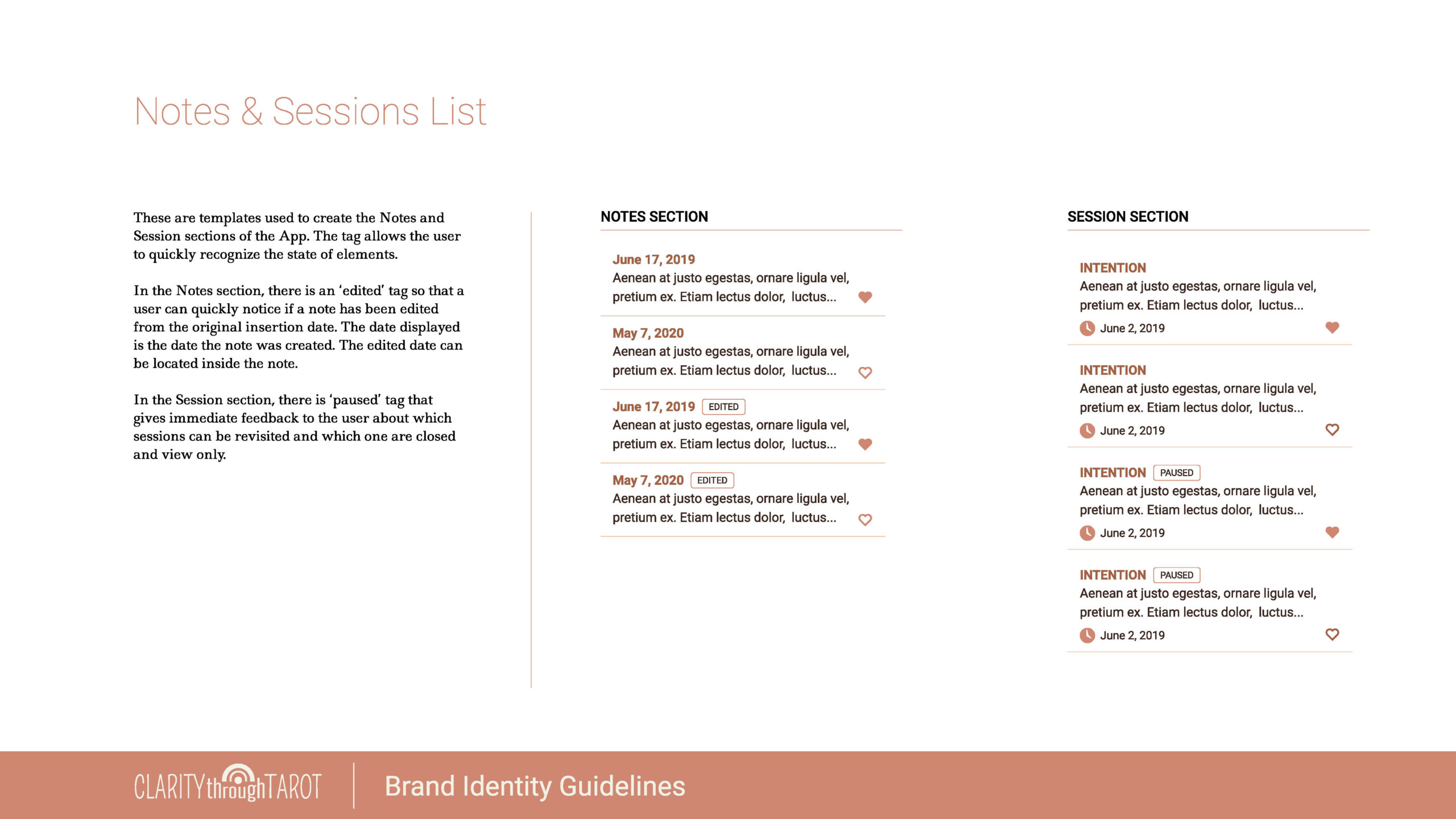
Once a note is added and assigned a creation date, it can be edited or deleted. All edited notes include an edit date tag. Once a note is deleted it is removed from the product. These features give the user full control over their personal notes area.
Future Considerations:
Include a way to recover a deleted note
ADD NOTE
EDIT NOTE
DELETE NOTE
View Previous Tarot Sessions
FEATURE
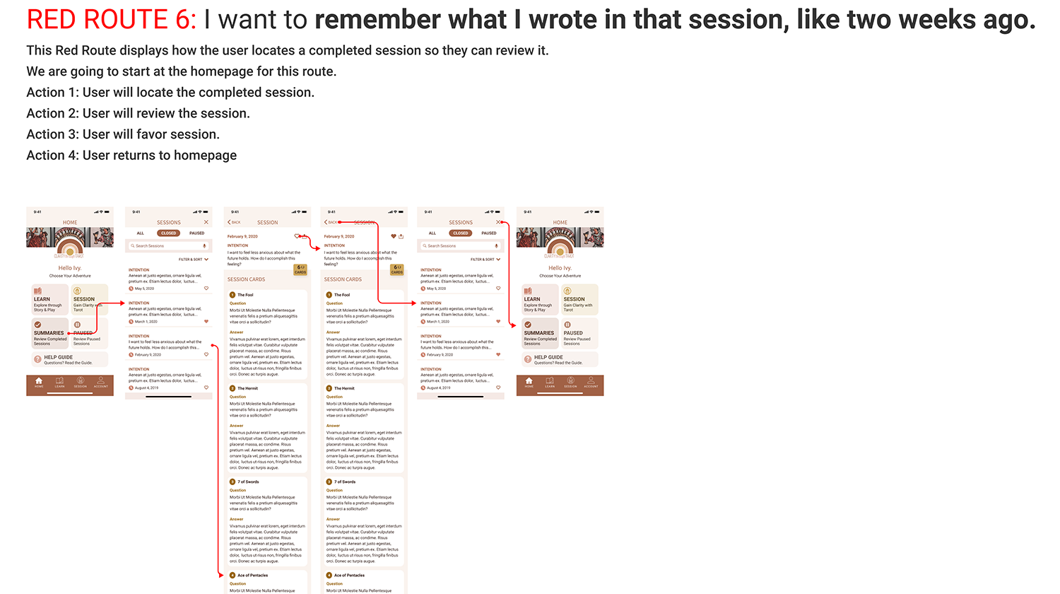
Reviewing and reflecting on past sessions is essential for continual self-growth. Clarity through TarotTM offers two options for a user to review a previous Tarot Session.
One option is to use the Sessions menu item inside the Tarot Archetype to display all past Tarot Sessions for which that Tarot Archetype was present.
Another option is to use the Summaries or Paused buttons to locate the previous completed and paused Tarot Sessions.
Future Considerations:
Streamline access to previous sessions
SESSION MENU ITEM
SUMMARIES & PAUSED BUTTON
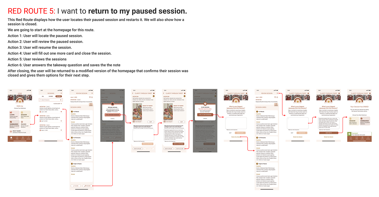
Review a Paused Tarot Session > Resume Session > Close Session
FEATURE
One of the features built into Clarity through TarotTM is an option to resume a paused session and return to the session on the next card. This video demonstrates how to review a paused session, resume it, and close the session.
Review a Paused Tarot Session > Close Session
FEATURE
This video demonstrates the ability to close a Tarot Session within the review state.
Future Considerations:
- Link each card title in the review session to the Tarot Archetype/Card (as a popover)
- Allow the Big Takeaway to be editable or allow closed sessions to have the ability to add more notes to the bottom of the session
- Add a “clarity” icon as another layer to signify BIG Insights; OR
- Add a star feature allowing the users to rate their insight around the Tarot Session (1 star = little insight, 5 star = Big Breakthrough)
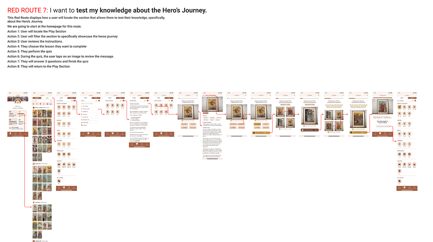
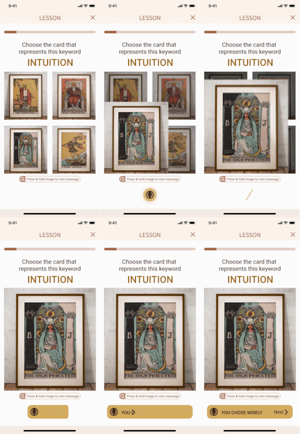
Test Your Tarot Knowledge
FEATURE
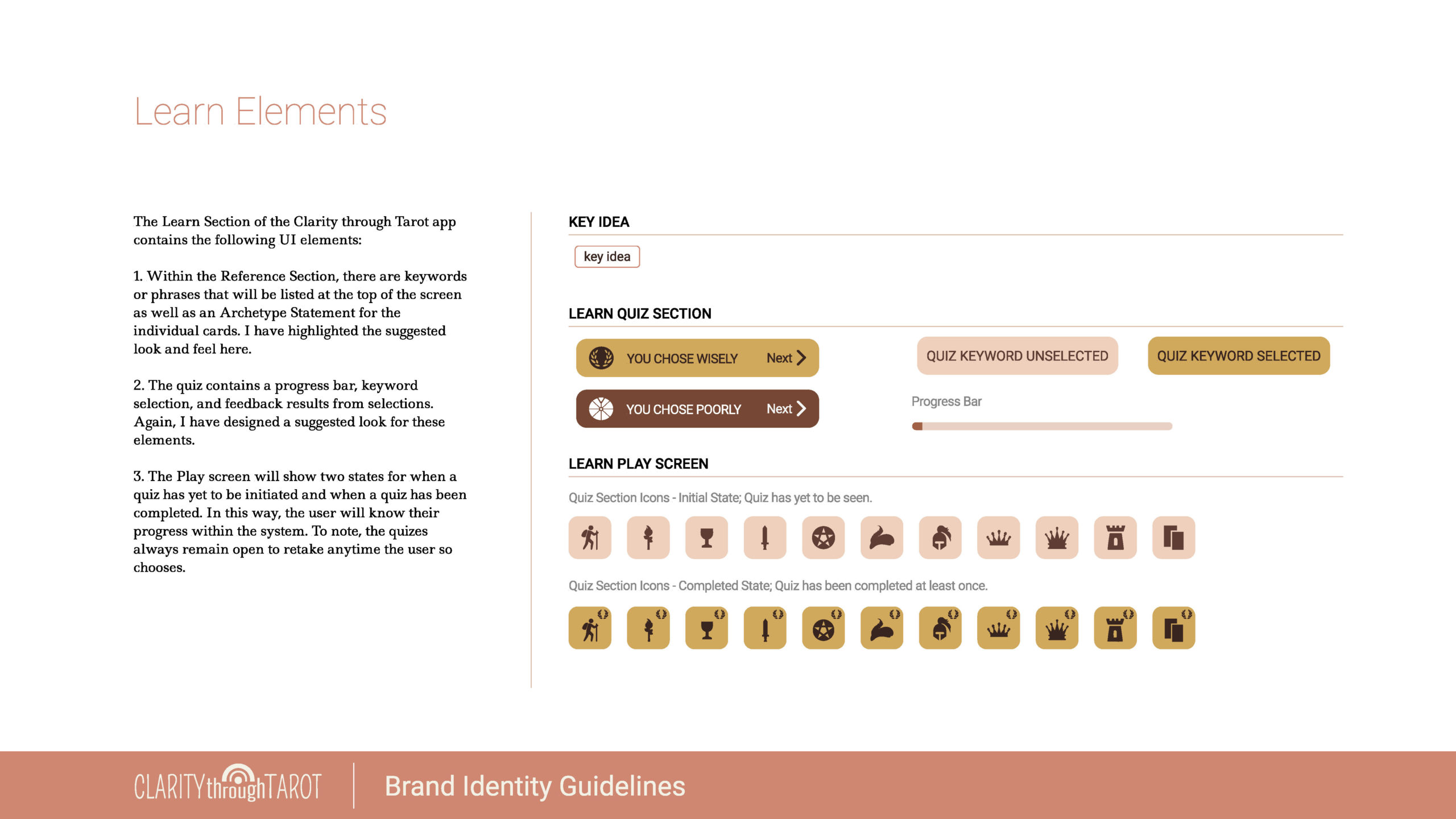
The Play section was included to help the user integrate the archetypes into memory through a quick little quiz. No grading. Cheating encouraged. It’s a fun way for the user to know if they are learning.
Future Considerations:
- Tutorial for first-time users
- Add Animation within Quiz
Animation Idea:
Help Guide
FEATURE
An area where users can quickly locate information on common questions.
Future Considerations:
Add Search Functionality
Account
FEATURE
An area that allows the user to modify their personal information, logout, and other standard profile features.
NEXT STEPS – Closing Thoughts and Reflections
To realize this product, my next step is to work with a product developer and professional Tarot copywriter. I have entertained the idea of crowdfunding the expenses to see this product into the marketplace in 2021.
All in a Day’s Work
The Clarity through TarotTM product was my passion project from December 2019 until August 2020. At the beginning of the project I was The Fool Tarot Archetype, naive and hopeful; midway through I was The Hanged One, with a new found perspective on the work it takes to build a mobile product. By the end, I became The World, enlightened and humbled by each step along the way.
I am eternally grateful to my supporters from design mentors to copywriters, from usability testers to friends and family volunteers in early-stage development.

